WHAT IS ARCHITECTURAL PHOTOGRAPHY?
Architectural photography is the art of aesthetically pleasing images of buildings and structures. Yet it does not have to be aesthetically pleasing, you could take close up images of the texture of buildings and structures. Architectural photography mostly cover old and modern buildings, factories or even farms, typically because of the bright colours. This type of photography not only covers the external features it also displays the buildings entirety. Architectural photography is not only to take pictures of buildings, however it is to highlight some of the details which put the building and area together to make it appealing to tourists and others. Normally, for these photographers they tend to take images where certain shapes could be eye catching including patterns on windows, stair railings or even wall and paint textures.
STATEMENT OF INTENT
My aim for this project is to demonstrate my ideas and reflect my artist research onto my work to show similarities and to develop/manipulate my images in photo-shop. My intention is to use Francesco Paleari as one of my artists that I would research because of his work being black and white which shows off as sleek and professional. By his work being double exposure I feel as if it is strange. My plan is to go to London and Preston to get that style of landscape and architecture to explore different locations to capture simple but different style of landscapes.
For my initial research I feel that using a Canon DSLR camera at manual with the shutter speed being fast as well as the depth of field being around f22 because the light would be perfectly exposed at the right points as well as the my model being on rule of thirds to show harsh lines that could be eye catching. I am going to show different landscapes at the different times of the year to show the contrast between the architecture and the model which will meld in photo-shop. By showing the best and worst image, it portrays that I have understood where I have gone wrong and feel that the worst will show what I should not do on my next shoot but by showing my best, will tell me that I need to keep that high standard for future references.
When I chose this theme, my initial thoughts were to take portraits of the people Manchester and manipulate the images in photo-shop however now I will be using my idea but also adding architecture into it by merging both images like Francesco Paleari. With the time we have been given, I feel as if experimenting with a wide range of techniques within my work such as double exposure but I wish to have my own twist where some aspects of the image has colour but others will be black and white. To show development and progression, I must be able to portray my photos in a uncanny way.
PLAN

ARTIST RESEARCH
Christian Richter

|

|
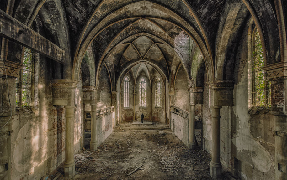
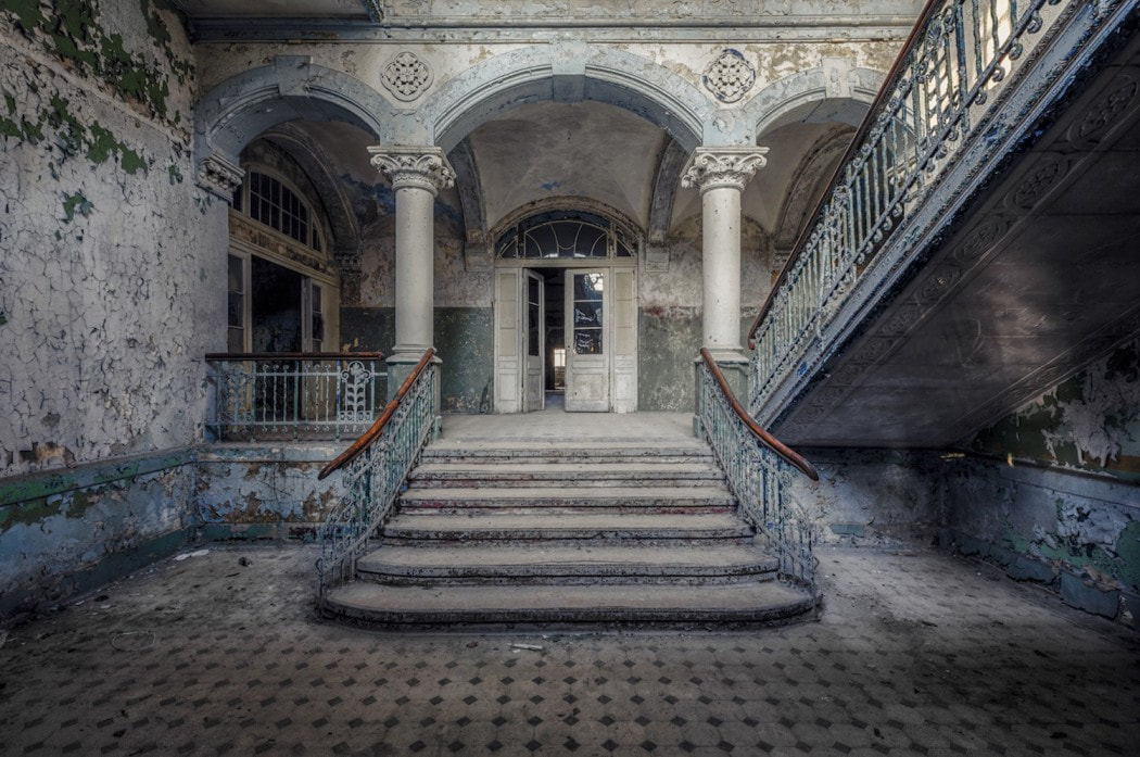
Christian Richter's work seems very mystical and dangerous because of the location and the position. I like where he places his camera, his main focus is in the middle such as the stairs and the swimming pool. The pillars and the stair railings are on a rule of thirds which backs up my statement where I said that the main focus is in the middle. Most of Richter's work include a vanishing point of perspective, this means that the back ground is far distance but still in focus. His work is symmetrical, this may show that building and it's history is very rigid. Each image has a small peak of the outside often viewed from windows. I feel as if Christian Richter has used these locations because of how it is musty, mucky and moldy and very atmospheric.
The images are at your eyes perspective and this makes it feel as if you were there and explored. The stairs are covering 1/3 of the image, which draws the viewers eye to middle. The calm colours was used such as, light blues, greens and beige, this gives the viewer a tranquil effect. The two main pillars has a contrast between the swimming pools because the pillars are a brown colour where as the water is a light blue. I like this photo because it is mysterious and weird.
I feel inspired by his work and might use his soft use of colour to inspire some of my own outcomes.
NORTH WEST
This is my first shoot. I went on location to Preston to capture landscape images with old buildings. I went in the summer to catch the sunlight. I used a DSLR camera and shot in manual. For my North West outcomes, I have planned to visit a castle and take different shots, some including close ups and some only being taken next to a river. I plan to use these shots for my final outcome when I manipulate them with people.
OLD B UILDINGS


BEST |
WORST |

This is one of my best pictures because of the sharp lines around the building as well as the depth of field being f22. I liked how the flowers stood out because it is not blurred but it also doesn't blend in with the background because of the differences between the colours from the background and the flowers. I was also impressed by how enhanced the colours of the flowers were compared to the rest of the image. The image being placed in an exterior setting fits perfectly with my artist research. With this perfect placement of the image being taken you can see a perfect amount of texture from not only the grass but also the brick lining from the building. The puddle of flowers not covering does loose the point of the rule of thirds however it still catches the attention of the viewer. I do feel as if my image was underexposed but it does give that mystery and magical mix to it.
|

I do not like this image because it is over-exposed and blurry. This loses the effect and point that I wished and hoped at the start. There is no rule of thirds which I initially intended for, the building is too far and loses the attentions of the viewer. The image being placed in an exterior setting is what I wanted but being so far away just makes the image feel and seem unwanted and bland. The trees blend in with each other and makes it look like a big green mess. I feel as if the image is bleached out, around f6. There is a large depth of field where as I would prefer the image to have a small depth of field, the building in focus and the rest to be blurry and fuzzy.
|
SHAPES


BEST |
WORST |

|

|
|
I feel as if this is my favourite image out of this shoot because of the worms out view as well as the texture of the wall being exposed on the right. I feel as if the green to cool tone colours of the wall and the sky is contrasted. I used my DSLR camera on manual with f22 to show the focus at the right places. The image is perfectly exposed with the correct amount of sunlight and shadows. The flower pots are on rule of thirds which catches the viewers eyes especially when the flower pot is brown, this pops out because of the surrounding areas being green and deep colours. I believe that this image has the best depth of field out of this shoot because of how brick at the front is out of focus but the surroundings is in focus.
|
I do not think this image is the best because of how far away the trees are as well as the flowers not filling the excess areas such as the brown floor. With the image being at f8 I believe that it is over exposed, I got this information from the sky being bleached out. I feel that there is no focus point but I also think that I should've tried a different view point. This image has a large depth of field but I would prefer my image to have a small depth of field, having flowers in focus but the surrounding being blurry and fuzzy.
|
DEVELOPING MY WORK
|
|

ARTIST RESEARCH
Ross Hoddinott

|
|
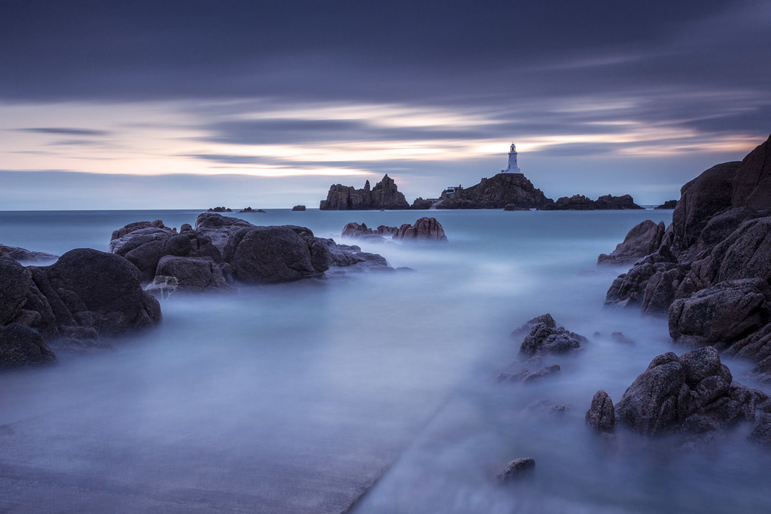
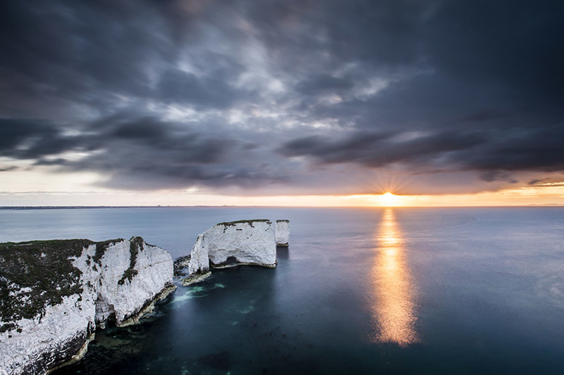
I take inspiration from Ross' work because of the reflection he achieves through out his shoots. The colours along with the beautiful landscape look great because it has neutral colours which has a contrast between the rocks and surrounding areas such as the sky and sea. It looks like it might been taken with a slow shutter speed since the water is smooth and so are the clouds however some photographs have a fast shutter speed and captures the water movement. In addition, this also means that a tripod was used. The rule of thirds and power points looks like they played a role in this photograph because the mountains were on rule of thirds. The photographer may have also used Photoshop to colour correct the image and enhance colours. With the viewpoints being straight it does make you feel as the viewer that you are there and experiencing the beauty in person.
CLOUDS

I plan to visit a river where I am able to take shots at different angles, with clouds reflecting in the river. I will use a DSLR camera on manual so I am able to control my depth of field and shutter speed. As I am working with water I plan to use a fast shutter speed so I have shots of the water moving. Some of the images will be taken from a worms eye view.


BEST |
WORST |

|

|
|
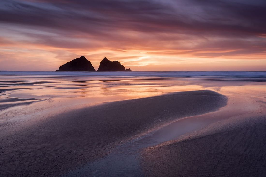
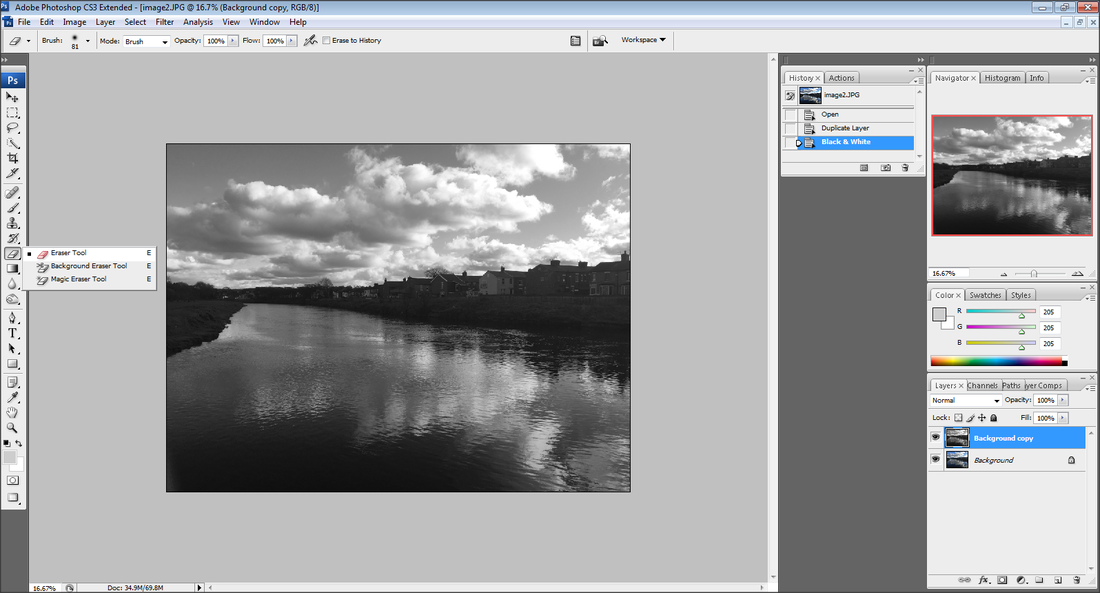
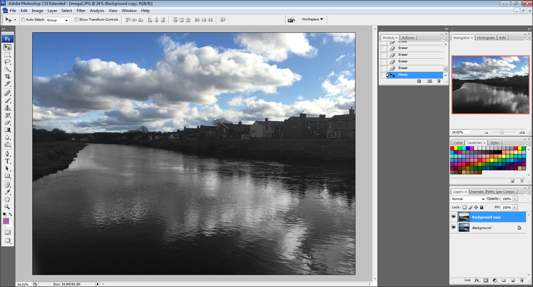
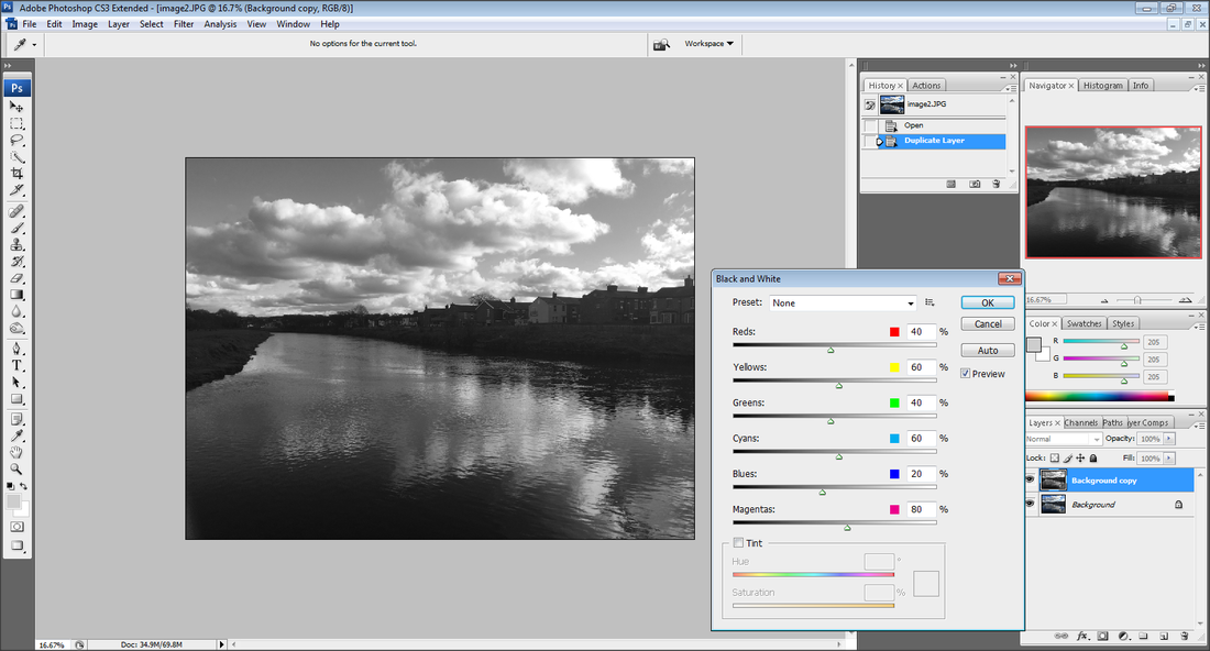
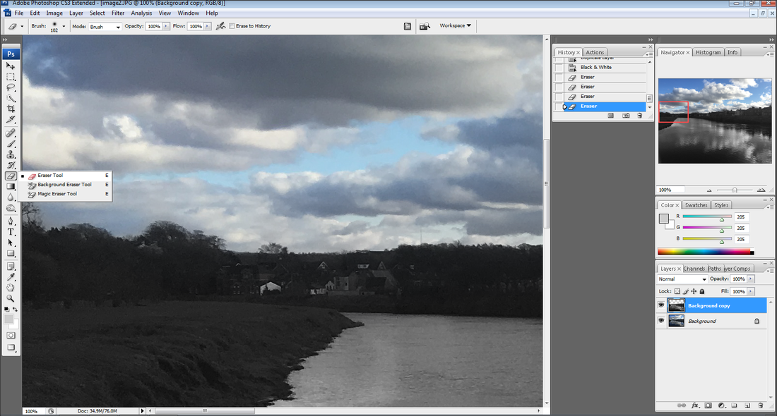
I like this image because of the sky reflecting in the water and I believe that I could use this to Photoshop and develop my ideas preferably with making the image black and white. This image having a small depth of field is better than a large depth of field. The short shutter speed is perfect because I am able to catch the water flow. This photograph was taken at f22 and this makes everything in the image have sharp lines. I would prefer to see the image at a different angle. The edge of the lake is on a rule of thirds line.
|
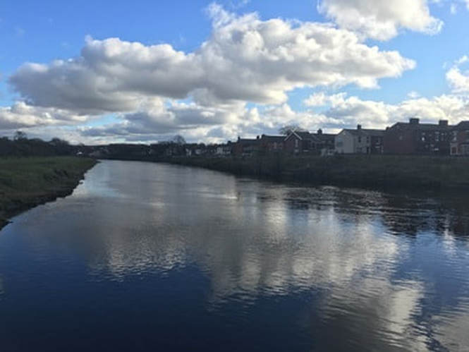
I do not like this image because I have not perfectly exposed this image. I would have changed my area or position. Next time I will take another try at taking images in this area in a different season preferably autumn because of the red leaves mid falling. I think this image is bland and needs more colour. I don't like how the road is in the centre, I would prefer it to be on one of the hot spots and have someone in it. The image has a slow shutter speed, which makes the image blurry and fuzzy.
|
DEVELOPING MY WORK
|
|

SECOND ATTEMPT
|
|

NEW LOCATION - LONDON
I am going to another location to improve my shoots, preferably a city instead of the country side, such as London. I will be taking images of people and architecture because I would love to be able to do double exposure. I will be using a canon DSLR and my architectural photography images will be taken of the exterior of the buildings but for my portrait images I will be taking my images in an interior setting.
ARTIST RESEARCH
Will Pearson

|

|

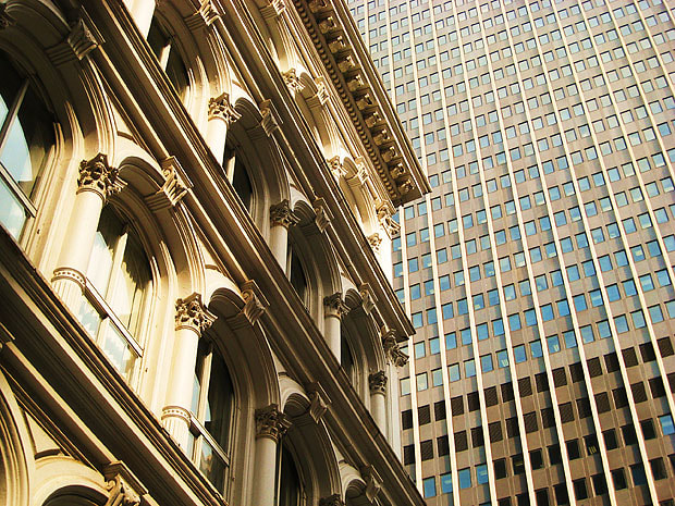
I feel as if this photographers work could resemble my work once I have taken my images in London of the London eye as well as being on a bridge and taking images of the St Paul's Cathedral, also taking images on a boat of the bridge from a far or up close. I like this photographers work because of how it relates so much to my plan but also how the bridge being on a rule of thirds gives the vision of it being far. The St Paul's Cathedral is eye catching because the bridge is guiding you to the middle which is called the vanishing point and this is a technique I will be pursuing through out my shoots. The colours being golden gives the image a rich feel and shows how expensive London is.
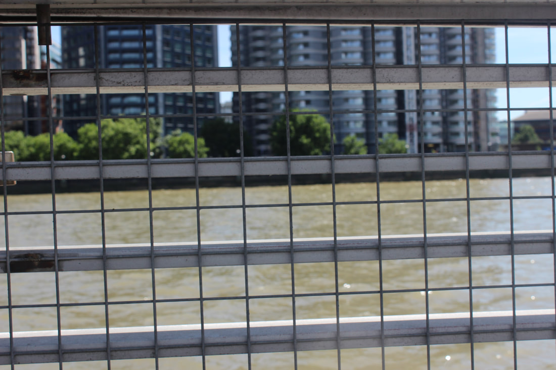
BRIDGES
Deborah Sandidge


BEST |
WORST |

I was impressed by how enhanced the colours of the pathway and the construction in the background were compared to the rest of the image. With this perfect placement of the image being taken you can see a perfect amount of texture from not only the people but also the brick lining from the building. I liked how the pathway stood out because it is not blurred but it also doesn't blend in with the background because of the differences between the colours from the background and the pathway. The building being in the middle does loose the point of the rule of thirds however it still catches the attention of the viewer.
|

I do not like this image because I have not perfectly exposed this image. I would have changed my area or position. Next time I will take another try at taking images in this area in a different position. I think this image is bland and needs more colour. I would prefer the lines to be on one of the hot spots. The image has a slow shutter speed, which makes the image blurry and fuzzy. This image was taken with a long shutter speed which resulted in a blurry image where as I hoped for a short shutter speed so the lines from the bridge was sharp.
|
DEVELOPING MY WORK
|
|

NEW BUILDINGS
Margaret Yescombe


BEST |
WORST |

I like this image because of the trees popping in. I also do like the buildings packed together and one building which is on a rule of third. The sharp lines around the building and the lamp posts as well as the depth of field being f22. I like how the leaves stood out because it is not blurred but it also doesn't blend in with the background because of the differences between the colours from the background and the leaves. The image being placed in an exterior setting fits perfectly with my artist research. With this perfect placement of the image being taken you can see a perfect amount of texture from not only the leaves but also the brick lining from the building.
|

I do not like this image because I have not perfectly exposed this image. I would have changed my area or position. Next time I will take another try at taking images in this area in a different position preferably without the lines. I think this image is bland and needs more colour and more buildings. I would prefer the lines to be on one of the hot spots. However, the image has a fast shutter speed, which makes you see the water movement.
|
DEVELOPING MY WORK
|
|

OLD BUILDINGS
Reto Fetz


BEST |
WORST |

I feel as if this is my favourite image out of this shoot because cool and neutral colours. I do like how I took the image at a worms out view so I could get the texture of the wall exposed. I used my DSLR camera on manual with f22 to show the focus at the right places. The building are on rule of thirds which catches the viewers eyes especially when the tree popping out. The image is perfectly exposed with the correct amount of sunlight and shadows. The image being placed in an exterior setting fits perfectly with my artist research because I am able to catch the blissful blue sky.
|

I do not like this image because of the position of the camera. I would prefer the image being straight or from a worms eye view perspective. This image is under exposed and makes the whole image look unprofessional. The camera seems to have been placed anywhere which also does look messy and untidy. I do not like this image because it is in an interior setting where I am not able to catch the sky and natural living things. With the slow shutter speed makes the image blurry. The depth of field was not taken properly in this image where if I took the image with a good depth of field I would make the foreground in focus and the background blurry and fuzzy.
|
SHAPES
https://pixabay.com/en/london-eye-ferris-wheel-london-254298/


BEST |
WORST |

I believe this is one of my best images that I took for this shoot because of the correlation to my artist research. I like how the bars are on the rule of thirds and the small depth of field which makes the bars only in focus and the background blurry. I used my DSLR camera on manual with f22 to show the focus at the right places. The image is perfectly exposed with the correct amount of sunlight and shadows. I do like how the image was taken outside because I got the waters movement and I got the rich colour of the leaves.
|

I do not like this image because it is not perfectly exposed, I believe it is too underexposed and it is too blurry. I used a small depth of field whereas I should have used a large depth of field so I could get the patterns on the floor. I would prefer to have my DSLR camera to be placed with the whole circle in shot because with this it makes the image look unprofessional. The image seems to have a long shutter speed which results in a blurry image which I was not intending for.
|
DEVELOPING MY WORK
|
|

SKYLINE
Jasper James


BEST |
WORST |

I believe this is the best image in this shoot because of the buidings covering the whole frame. The image was taken at a birds eye view, I like this because it gives me the opportunity to fit more in than taking the image from a worms perspective. I took the image with a long depth of field so that everything is in focus. I like how certain colours stand out such as blues and golds which when I develop my work I will keep those colours in but make the surrounding areas black and white.
|

I do not like this image because someone has blocked the view and the sky is bleached out by my DSLR camera being set on a long shutter speed. I think I should have faced my camera down so only the buildings are in the shot. This image has a short depth of field and I don't like this because I would prefer everything to be in focus.
|
DEVELOPING MY WORK
|

|

CLOSE UP


BEST |
WORST |

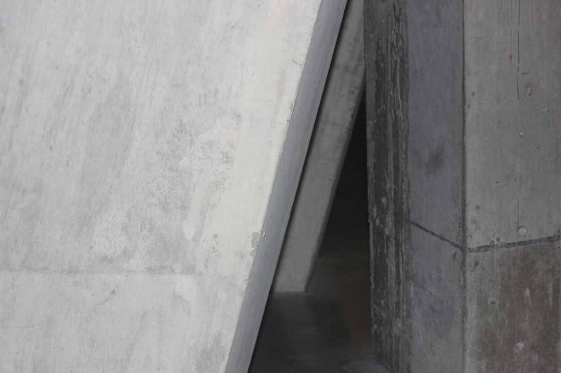
I feel as if this is my favourite image out of this shoot because of the worms out view as well as the texture of the wall being exposed. I feel as if the brown to cool tone colours of the wall and the sky is contrasted. I used my DSLR camera on manual with f22 to show the focus at the right places. The image is perfectly exposed with the correct amount of sunlight and shadows. The image being placed in an exterior setting fits perfectly with my artist research. The building are on rule of thirds which catches the viewers eyes especially when the bricks are brown, this pops out because of the surrounding areas being blue and warm colours.
|

I do not like this image because of the position of the camera. I would prefer the image being straight or from a worms eye view perspective. I do not like how half of the image is under exposed because it makes the image look unprofessional. The camera seems to have been placed anywhere which also does look messy and untidy. I do not like this image because it is in an interior setting where I am not able to catch the sky and natural living things. However, this image has a fast shutter speed which I do like.
|
DEVELOPING MY WORK
|

|

TEXTURE
Aaron Siskind

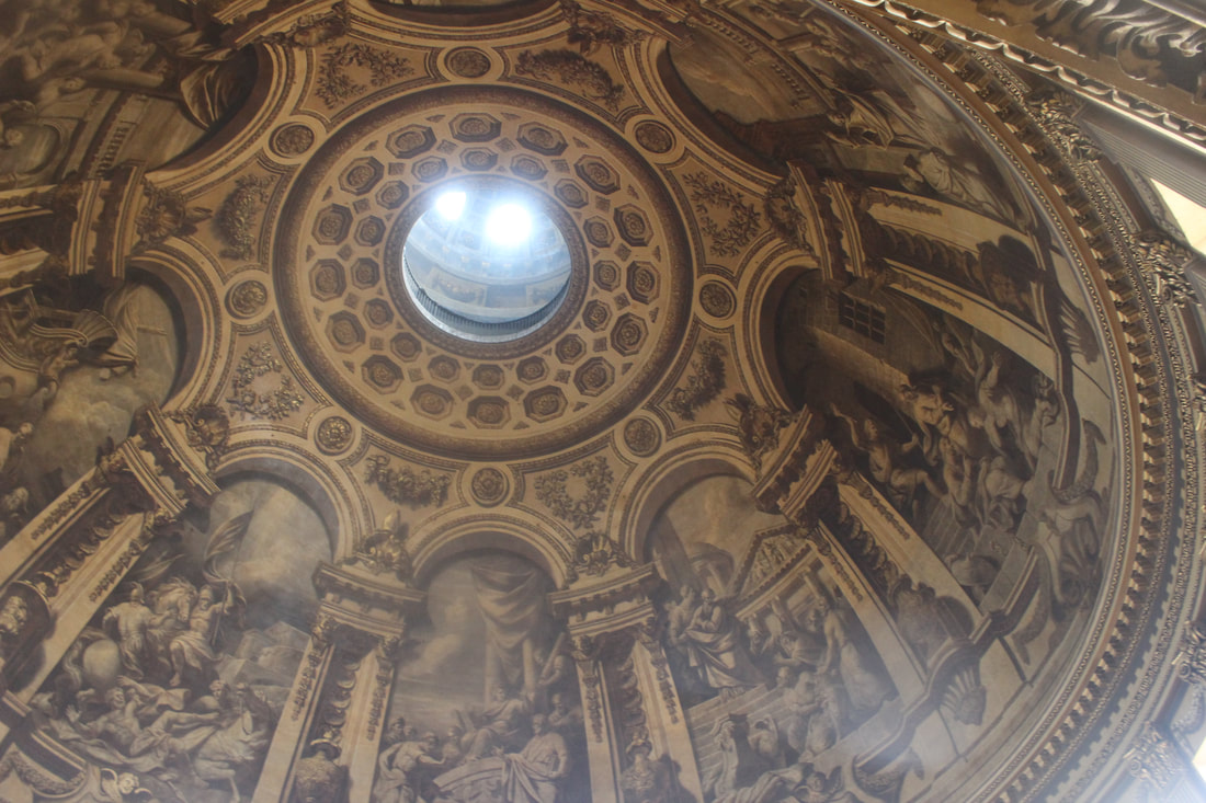
In this photo, Aaron Siskind displays the texture of buildings wall and the lines are on the rule of thirds giving the image direction to the middle. As the paint is falling off it gives the image a background story and context. I like the simplicity of his work and the shapes that he includes. The zoomed in the image is because it gives the image a meaning of loneliness and separation. The image being black and white seems as if we don't know when it was taken then again we still get an idea of when it was taken through the texture because the light reflecting on the wall which could show that maybe these images were taken in spring or summer.
|

|

|
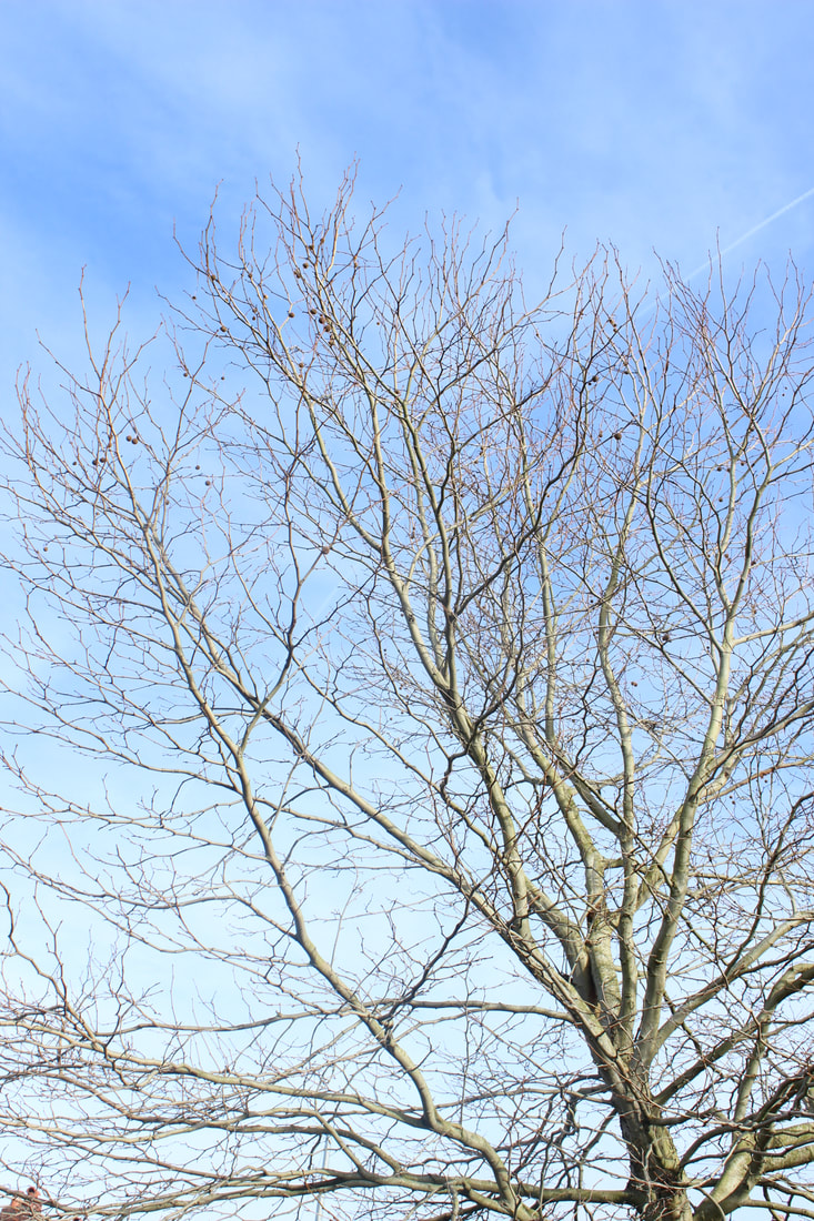
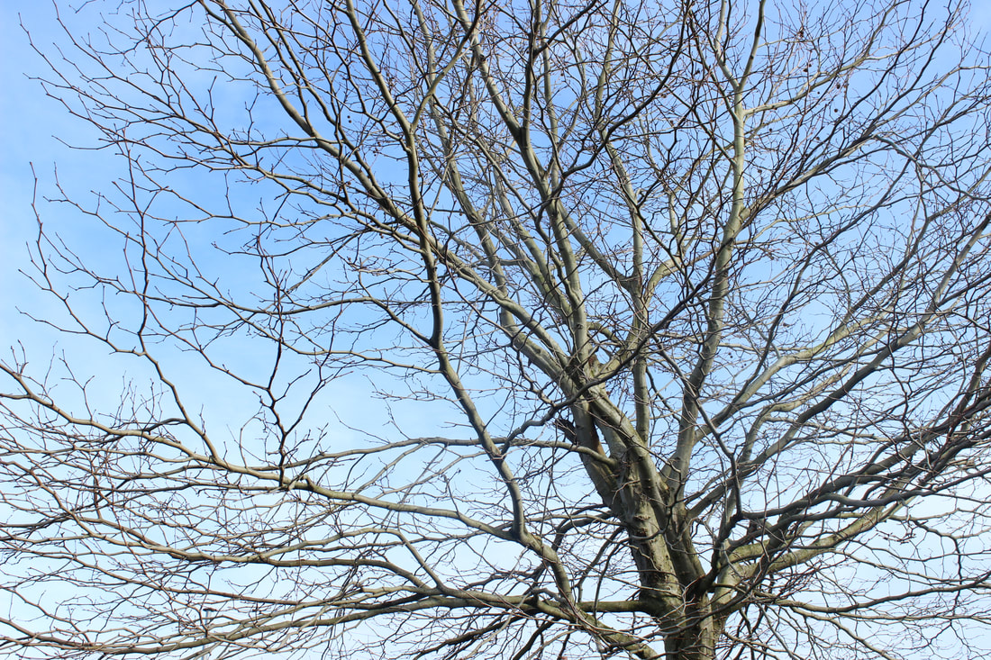
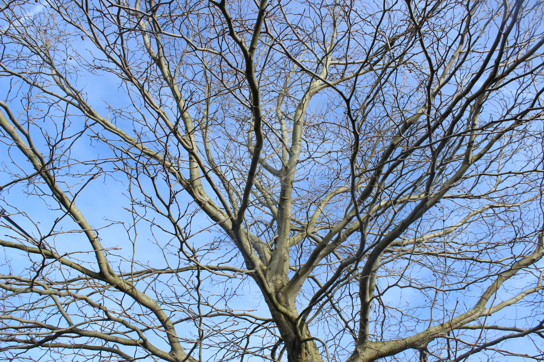
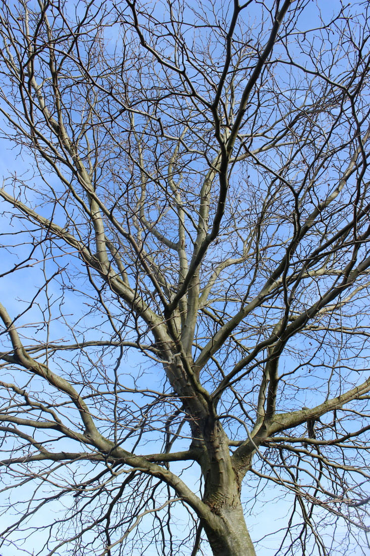
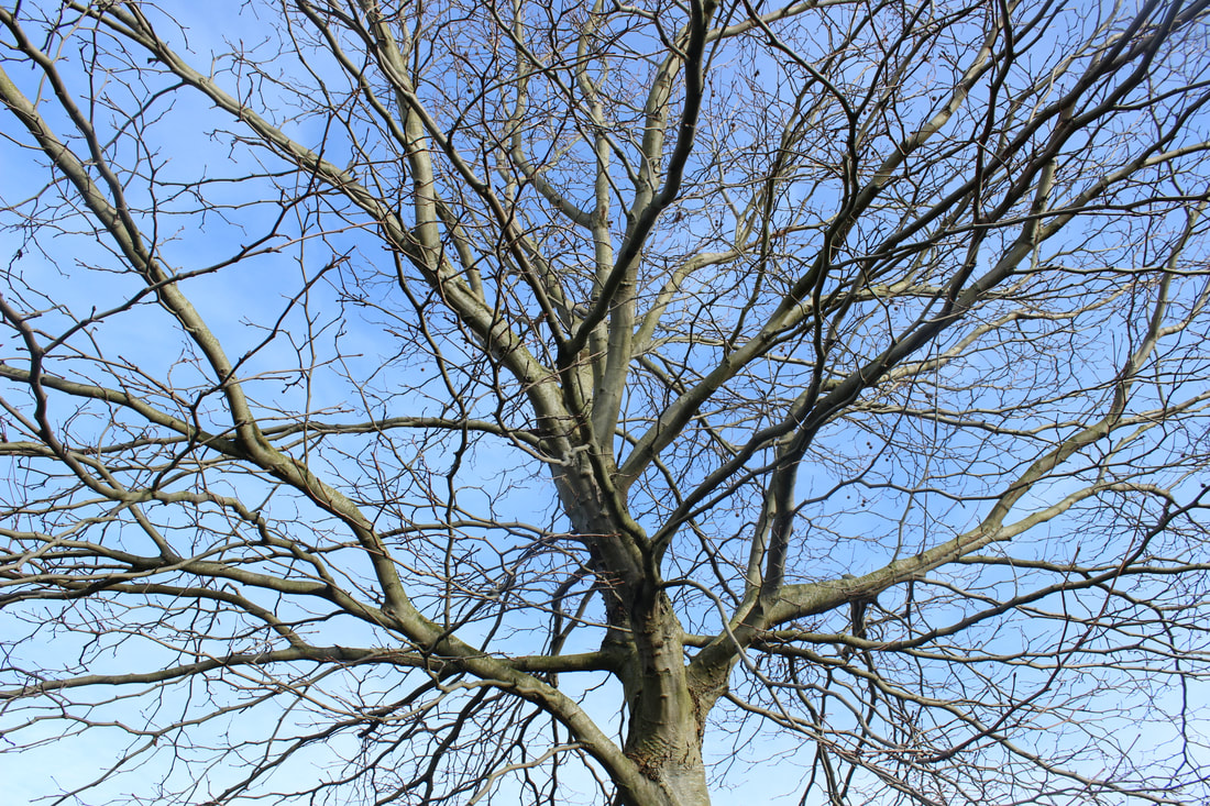
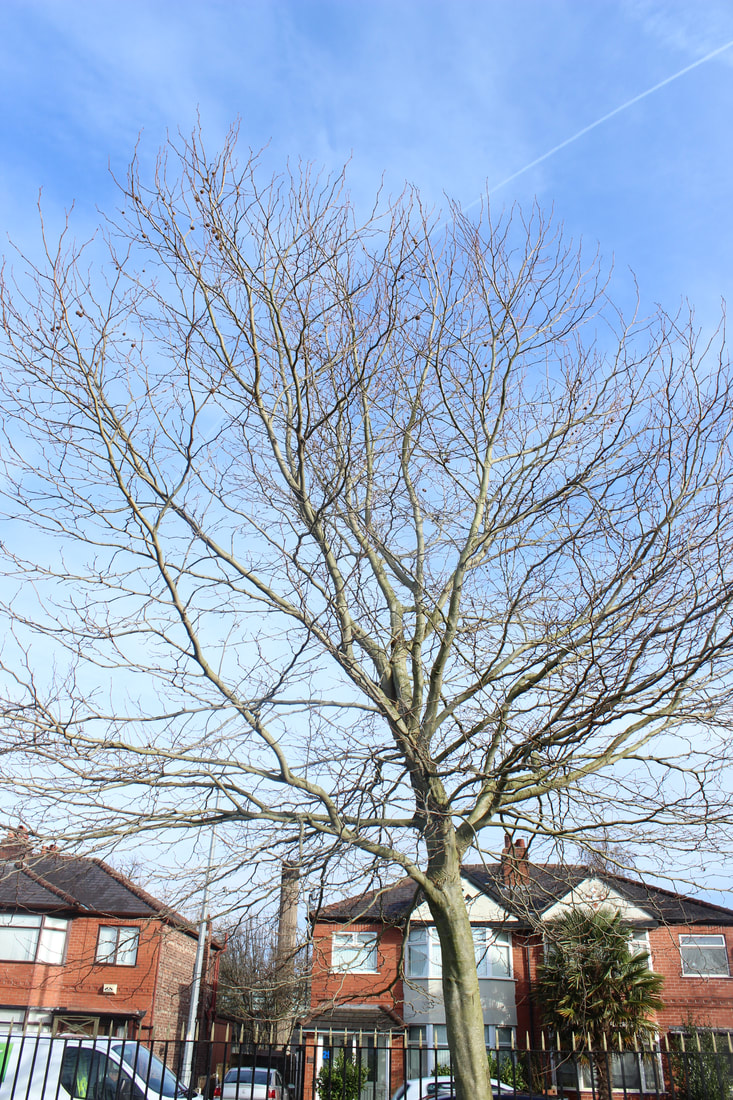
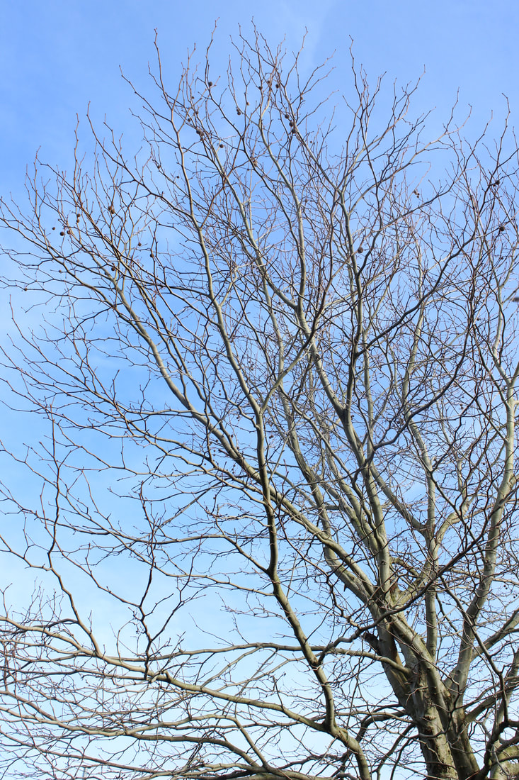
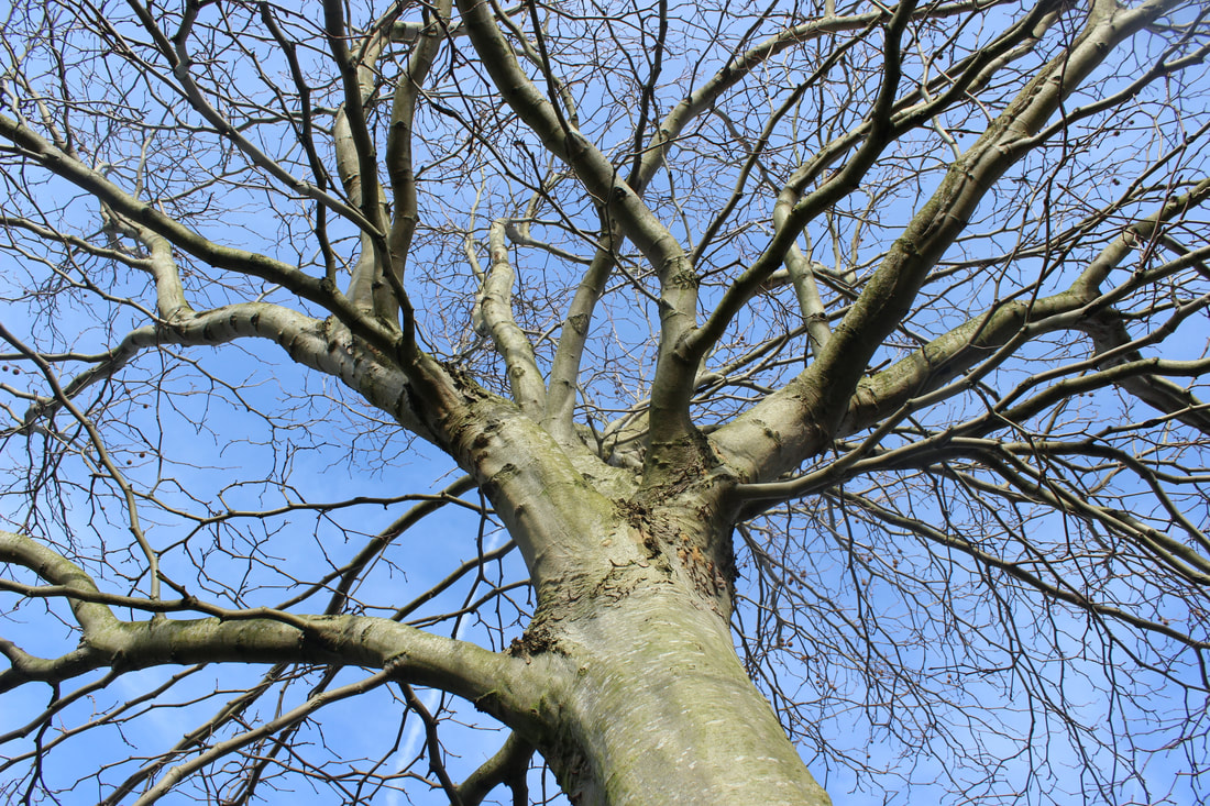
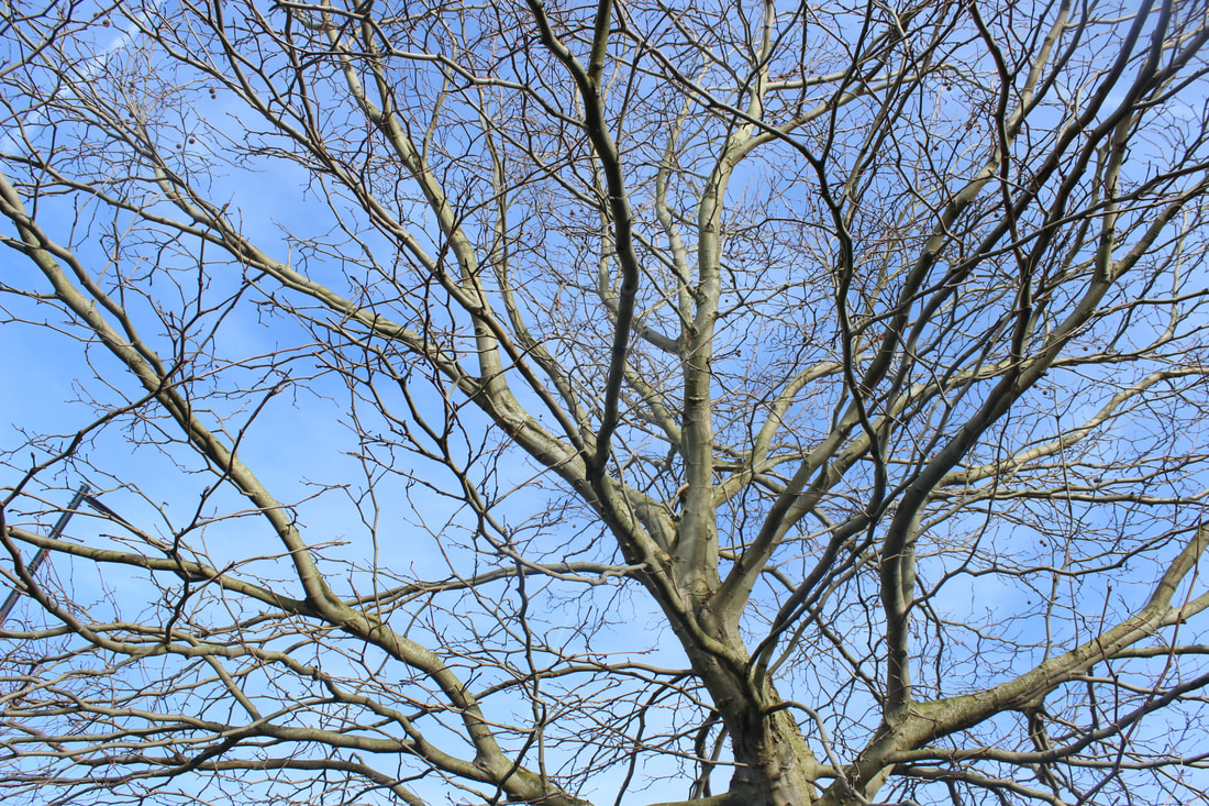
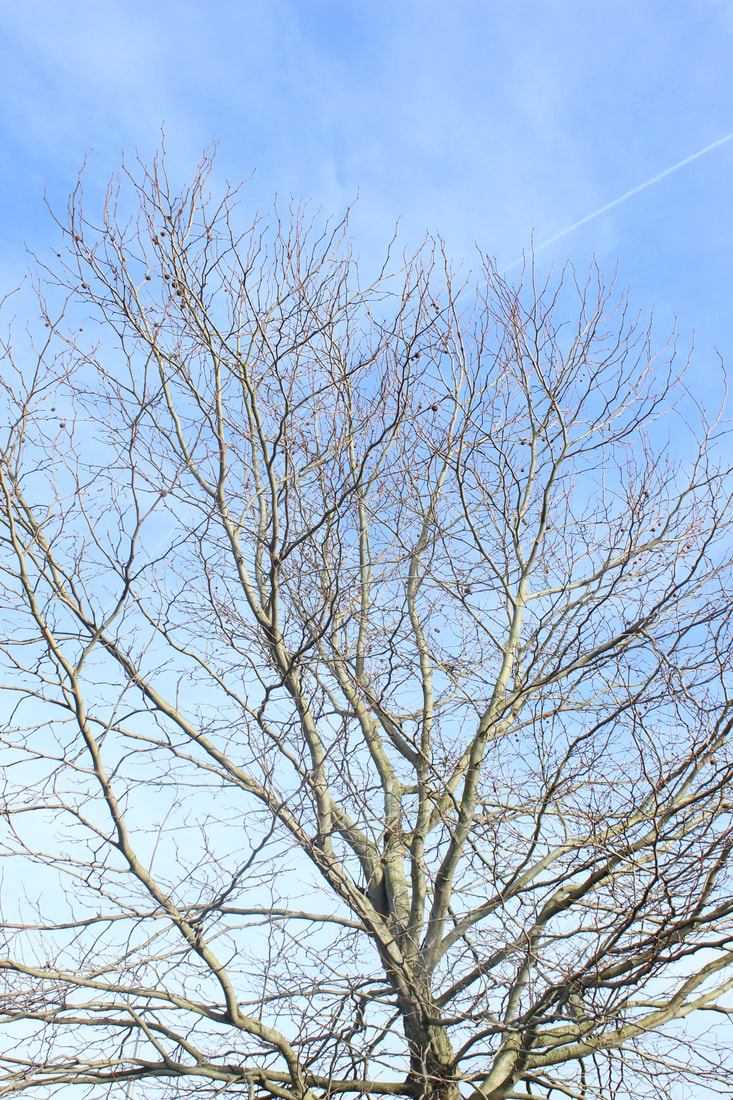
TREES

|

|
|
FURTHERING MY IDEAS
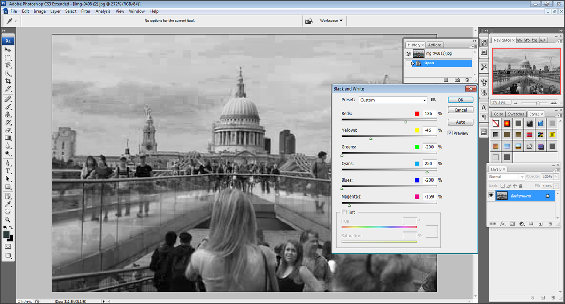
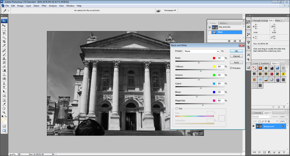
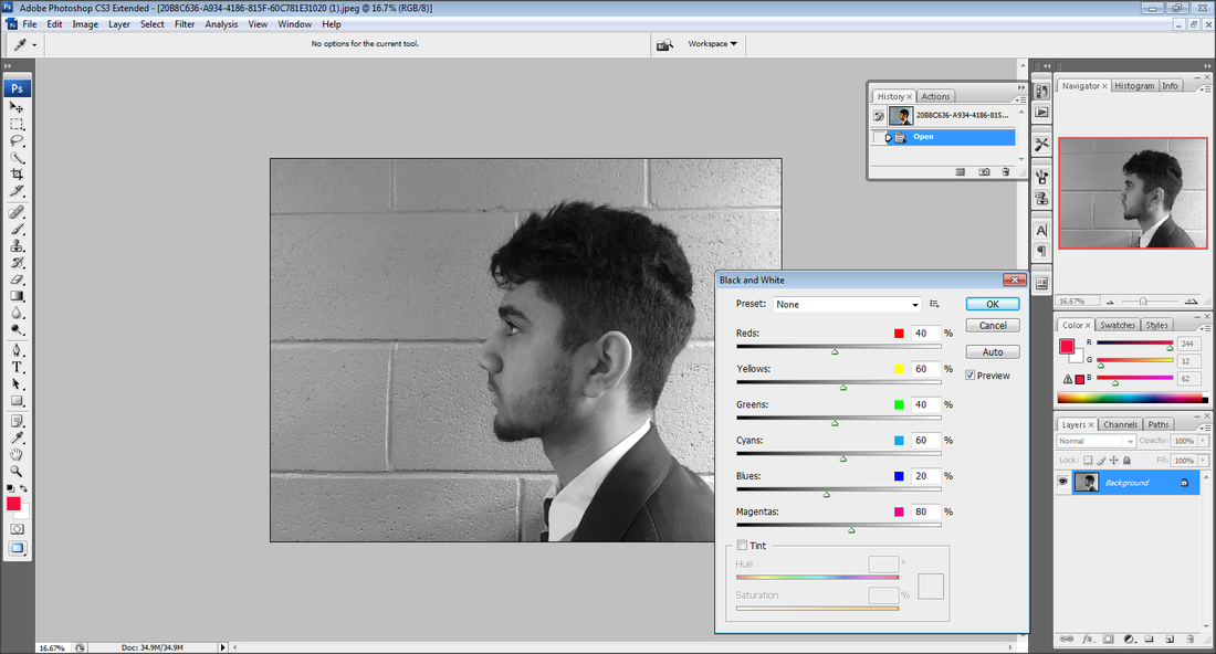
I am researching the work of Berenice Abbott because I am inspired by his work, the way his end result perfect images is black and white, this shows sleekness and tidiness. I think their work links to mine because of the image being black and white as well as the photo being sharp and at f22. I am going to use their work to inspire mine by taking my images in an exterior setting. I am going to do this by going outside and take images in town and other places. To make further progress with my project I now need to develop my outcomes further. In order to do this I need to focus on my work of black and white images and use photo shop to improve my outcomes.
ARTIST RESEARCH
Francesco Paleari


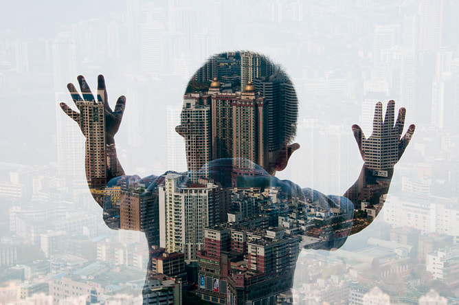
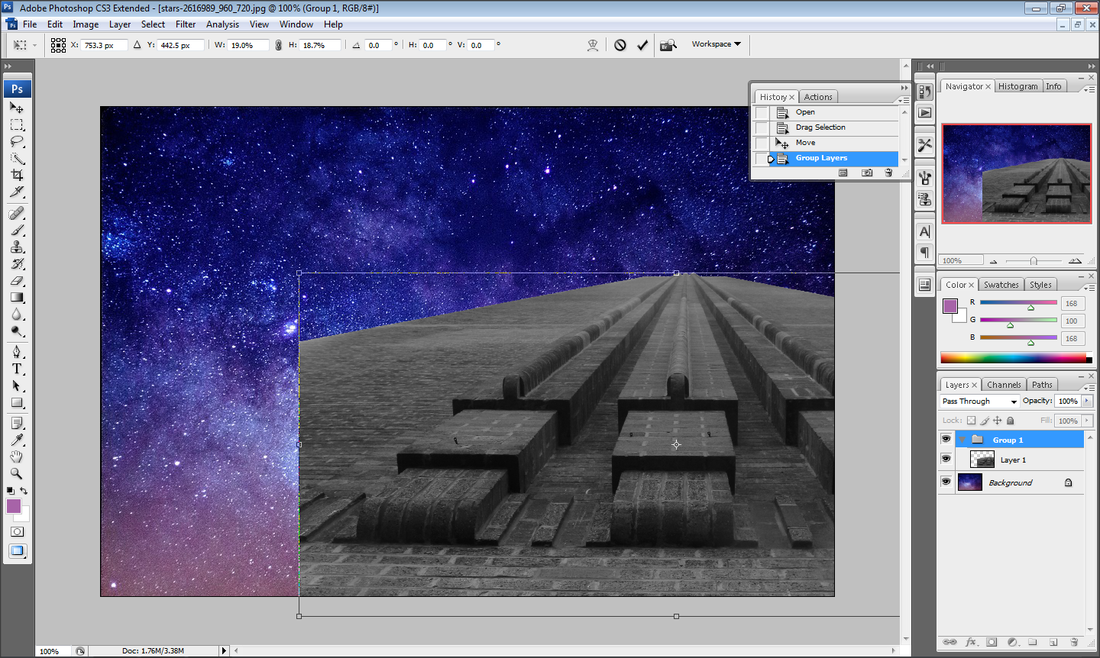
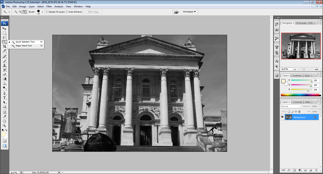
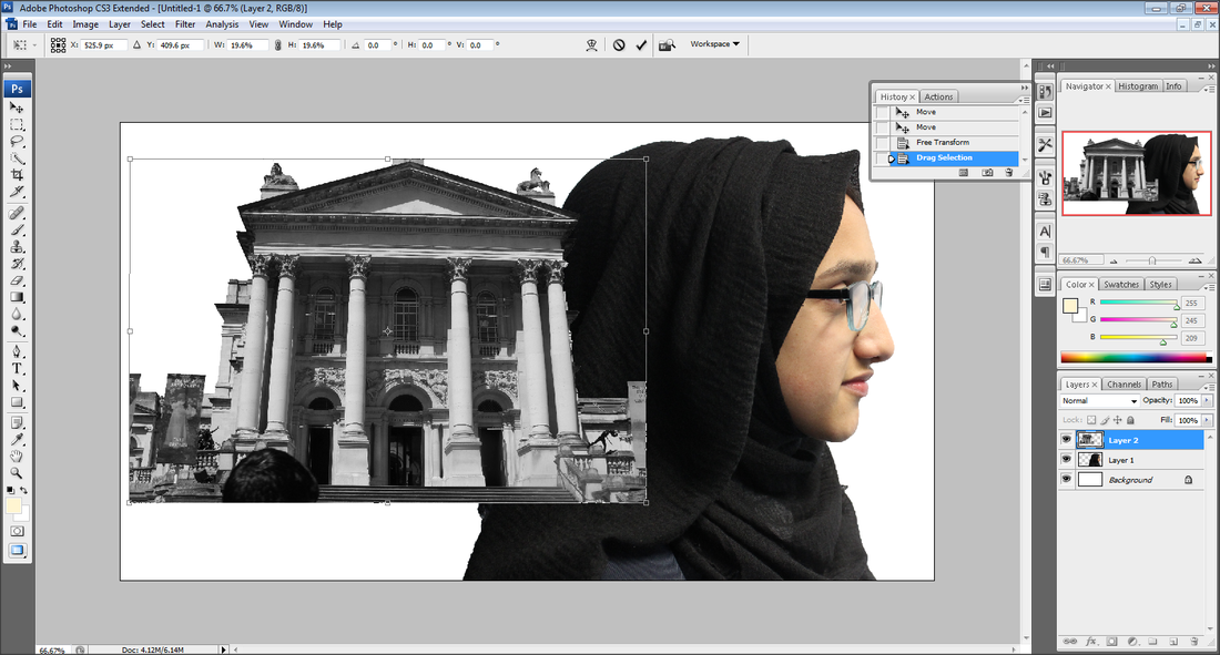
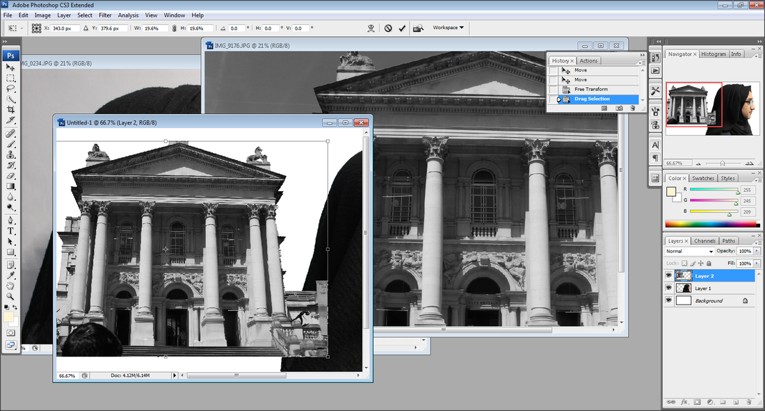
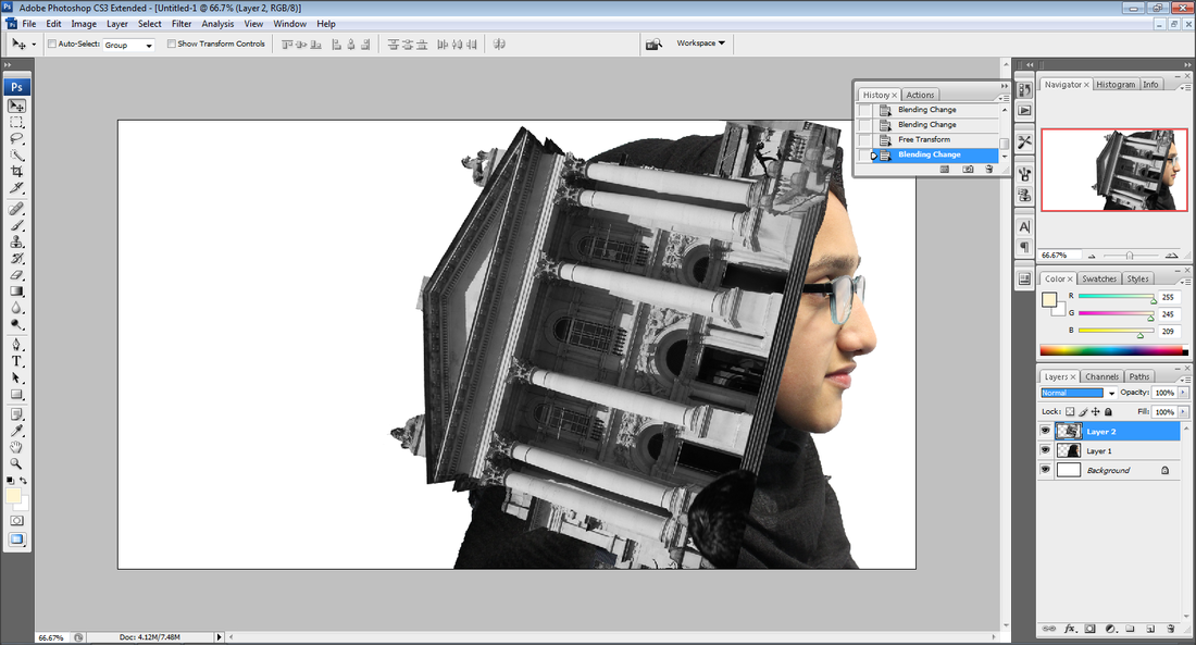
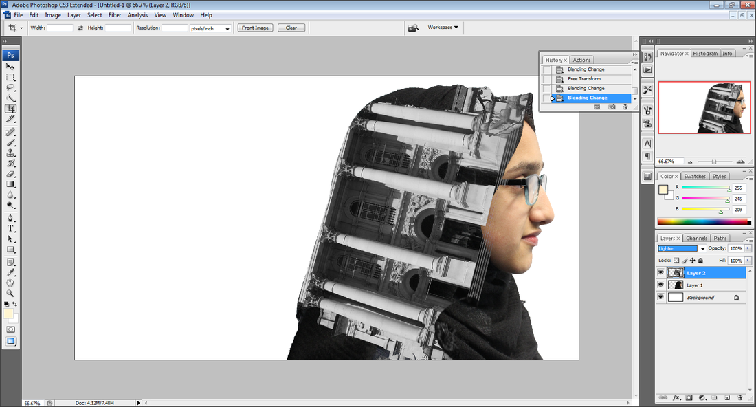
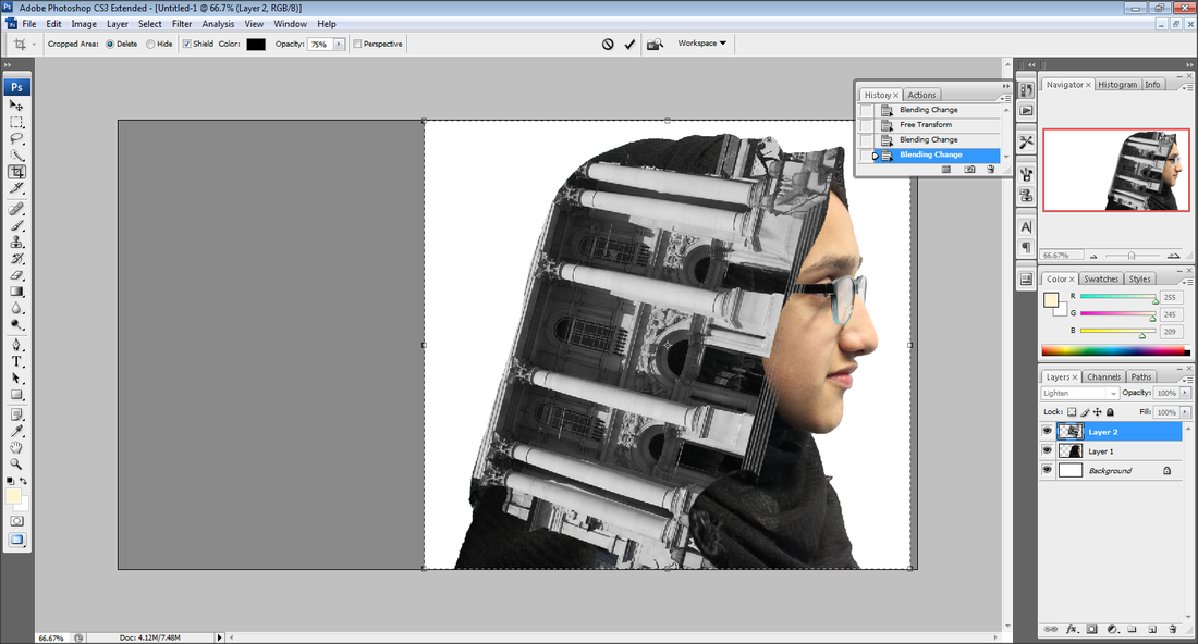
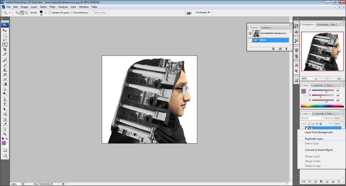
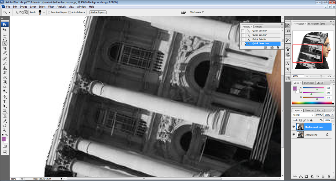
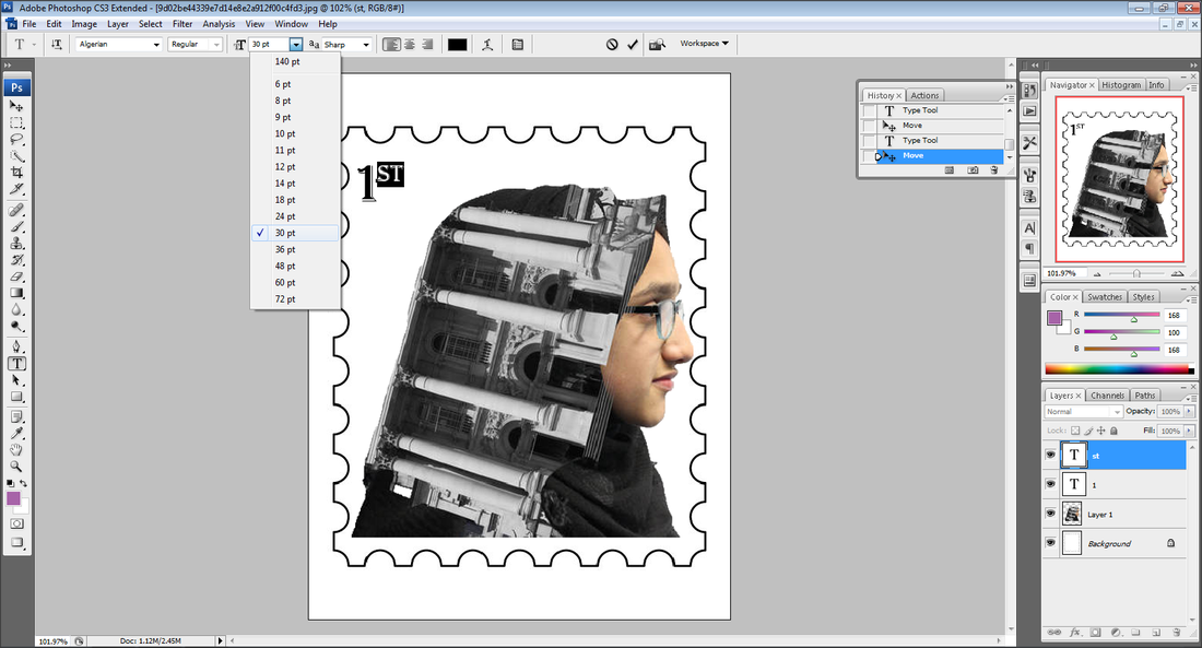
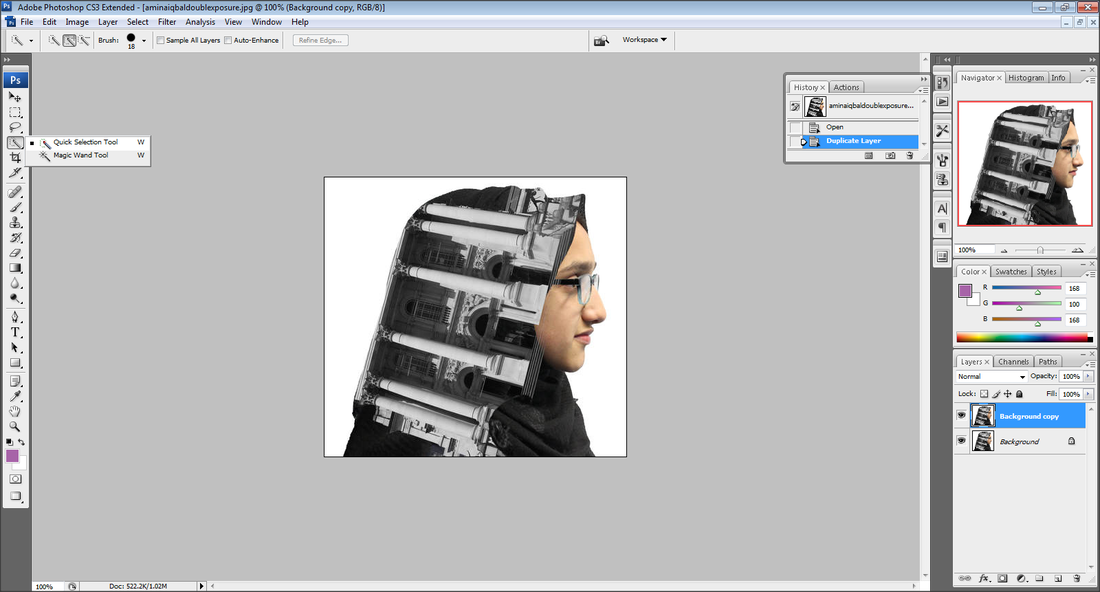
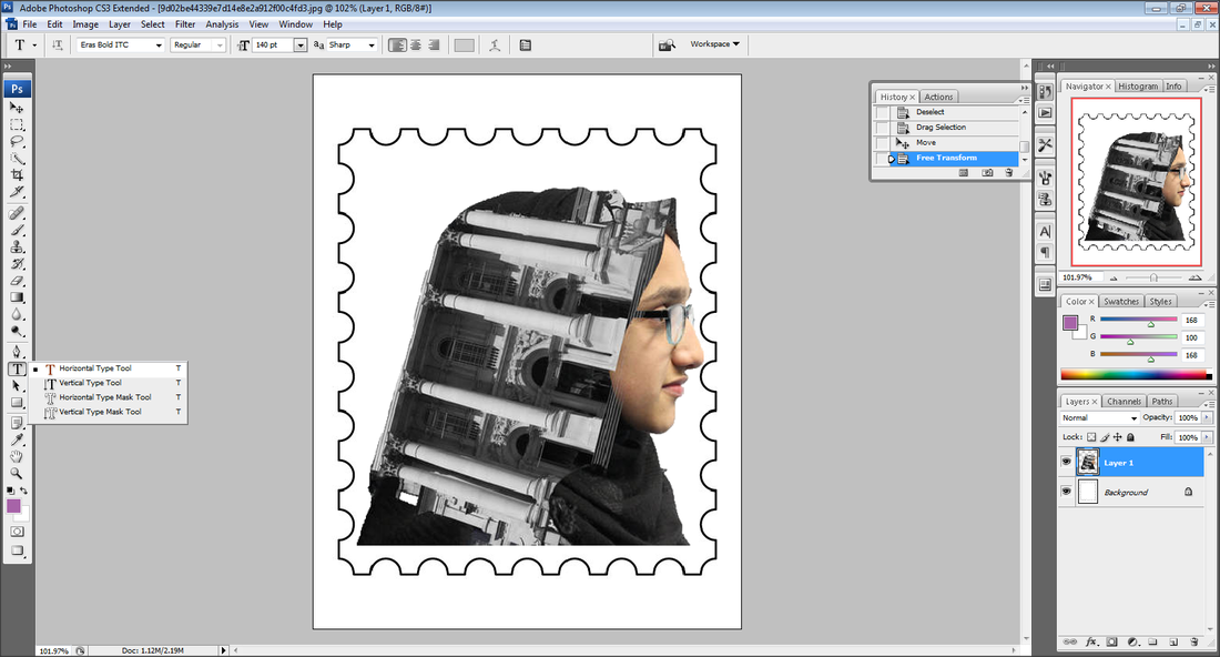
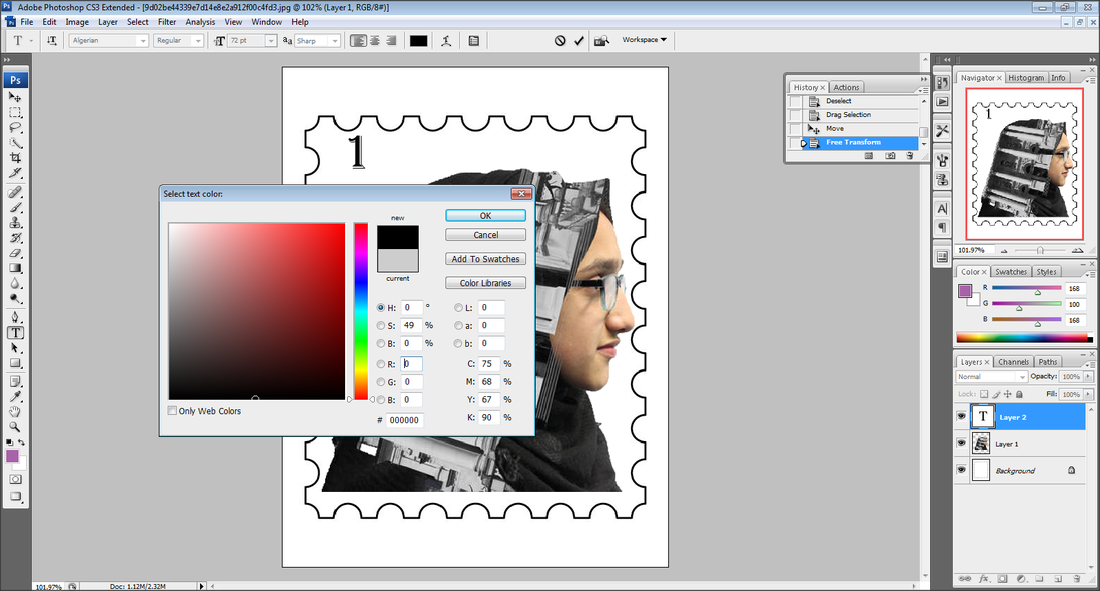
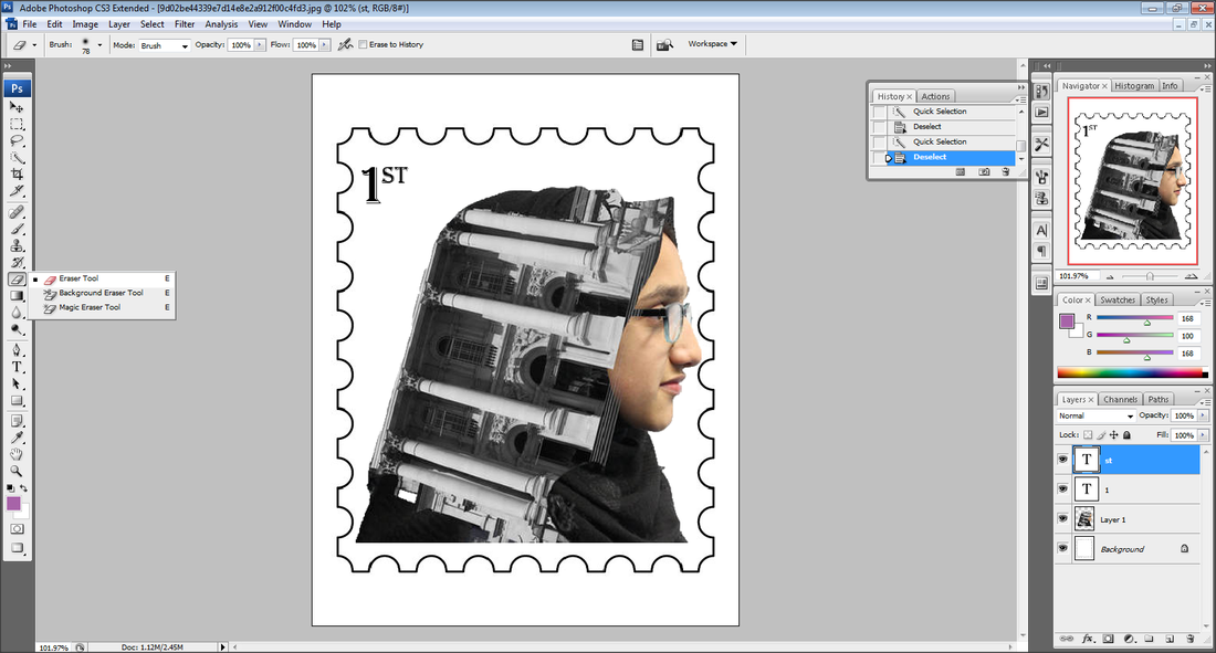
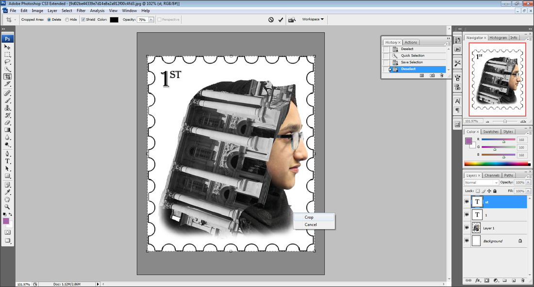
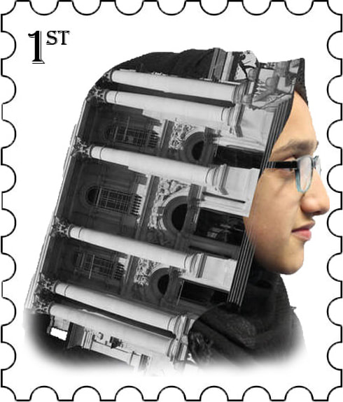
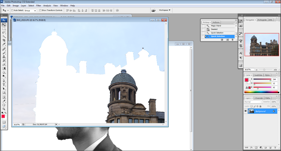
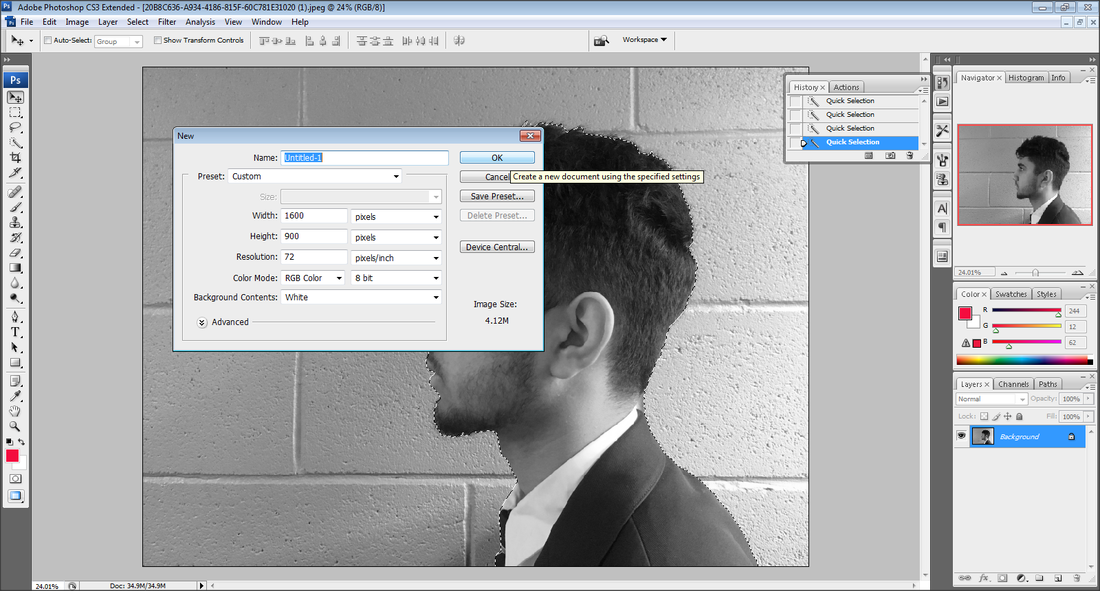
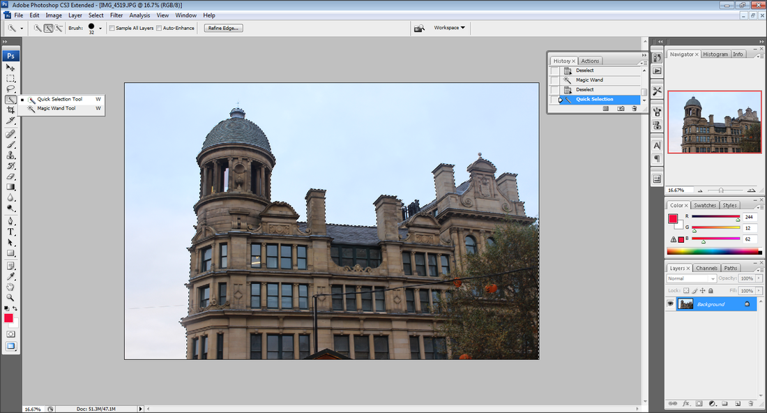
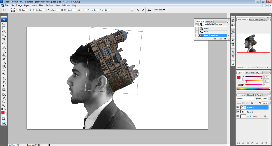
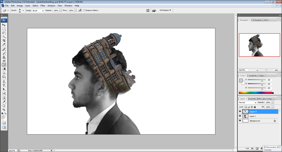
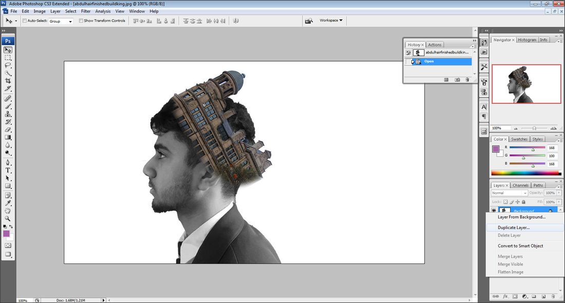
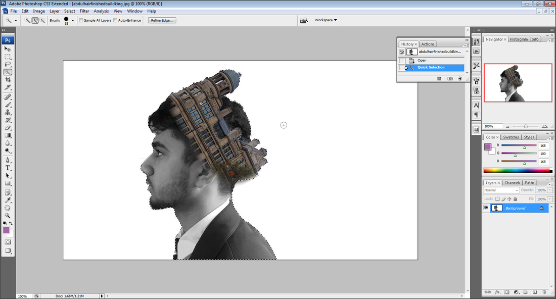
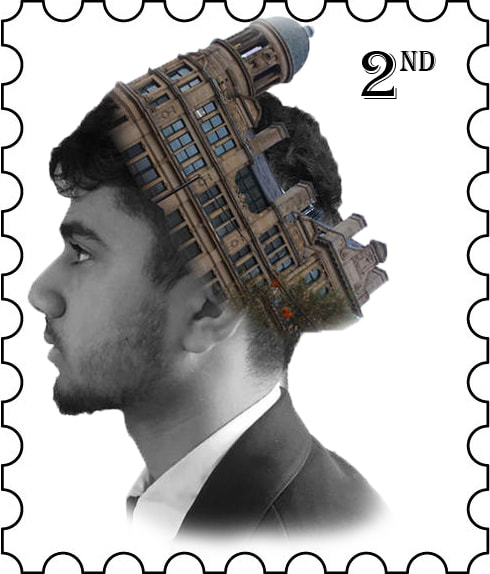
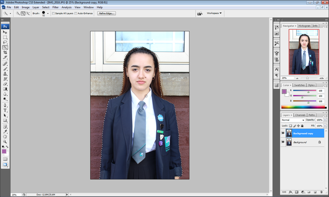
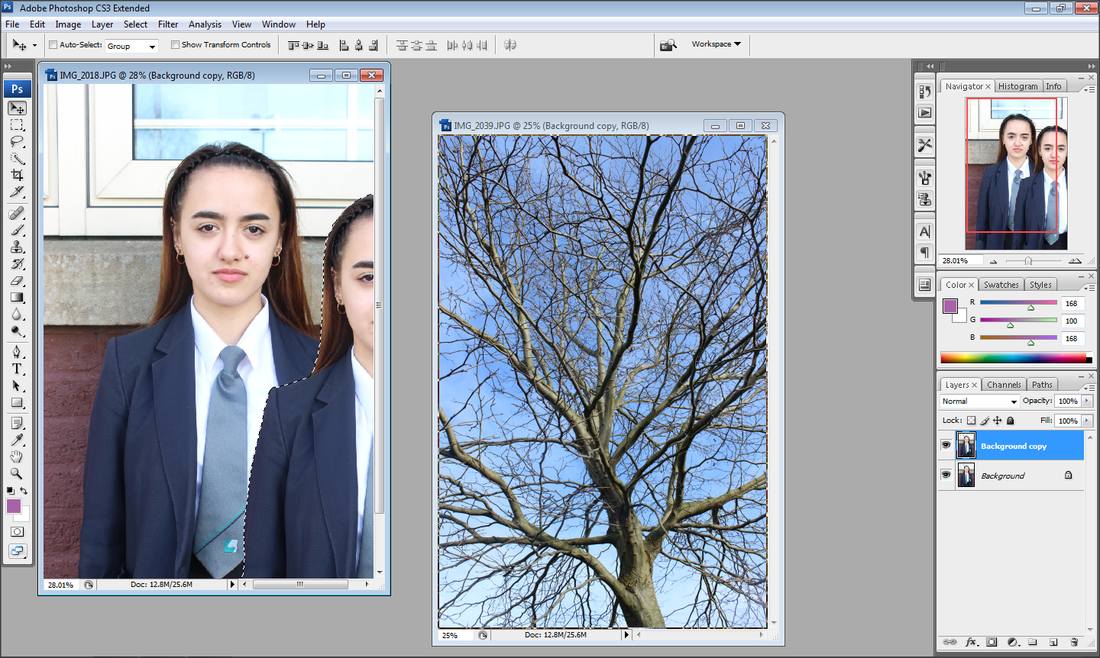
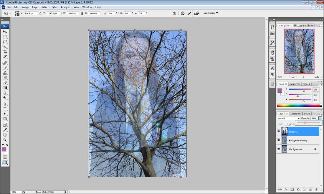
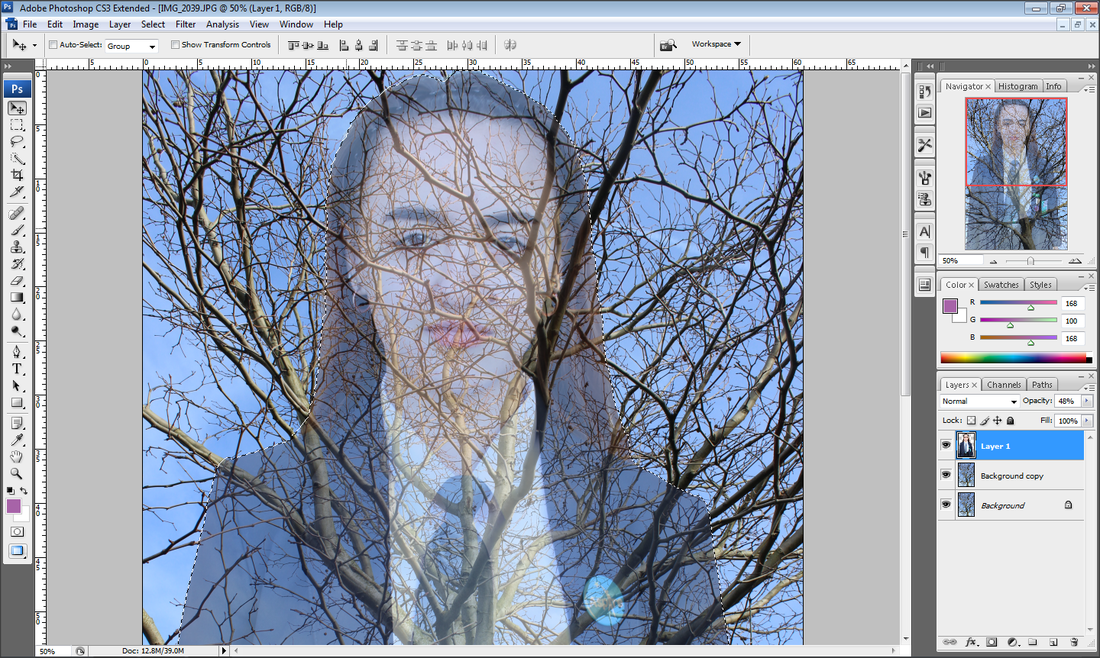
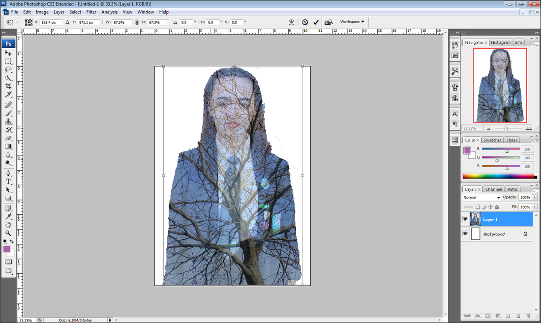
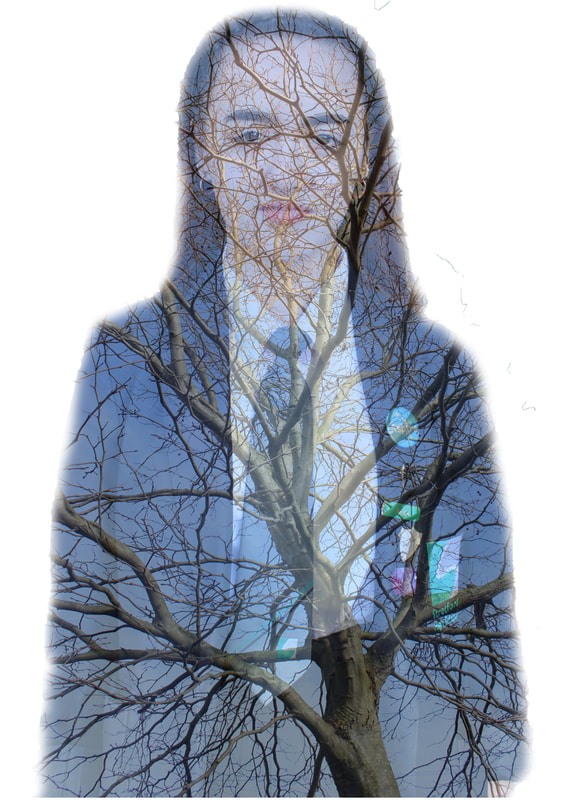
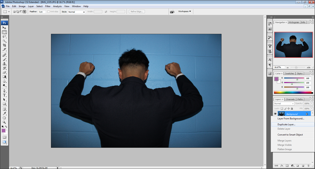
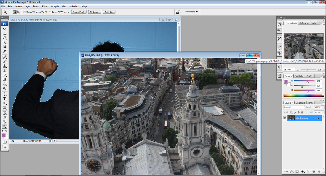
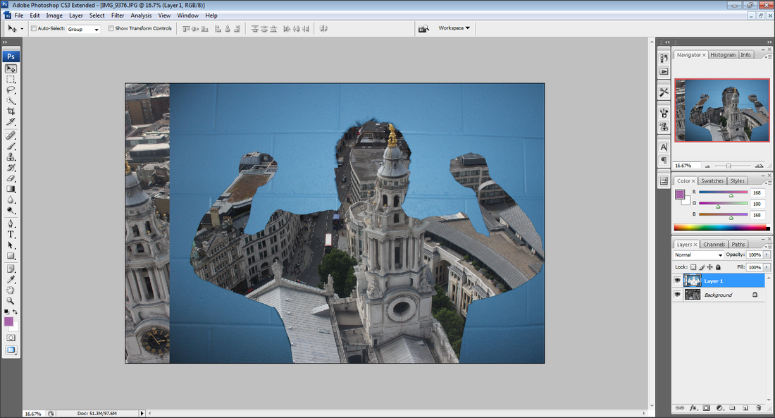
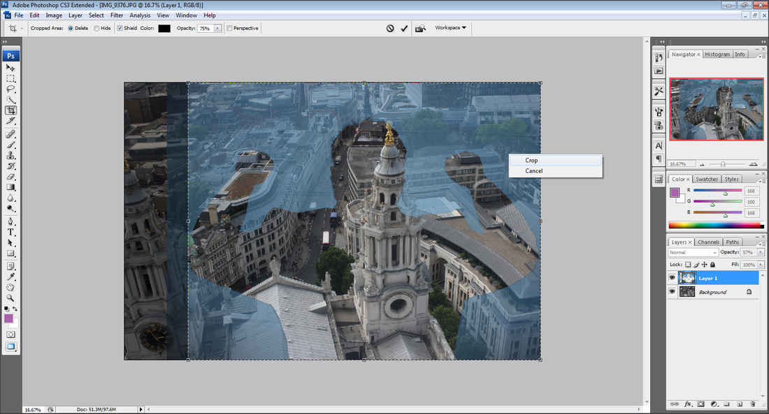
Francesco Paleari's work is unique, merging people and architecture together. The photographer merges half a person and the other half of a building to show how people are the city. Paleari's uses the shape of the buildings to create a dramatic affect on the viewer, with the maintained facial features of each person. His work being black and white makes it seem professional. Paleari melds the architecture and the people so perfectly to make the image seem realistic. This photographer had achieved this look by double exposure. With the model being in the middle it rules out the rule of thirds however it is eye catching because they are placed in the middle and taken at a medium shot.
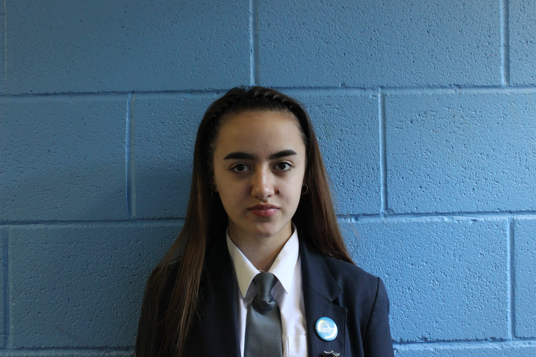
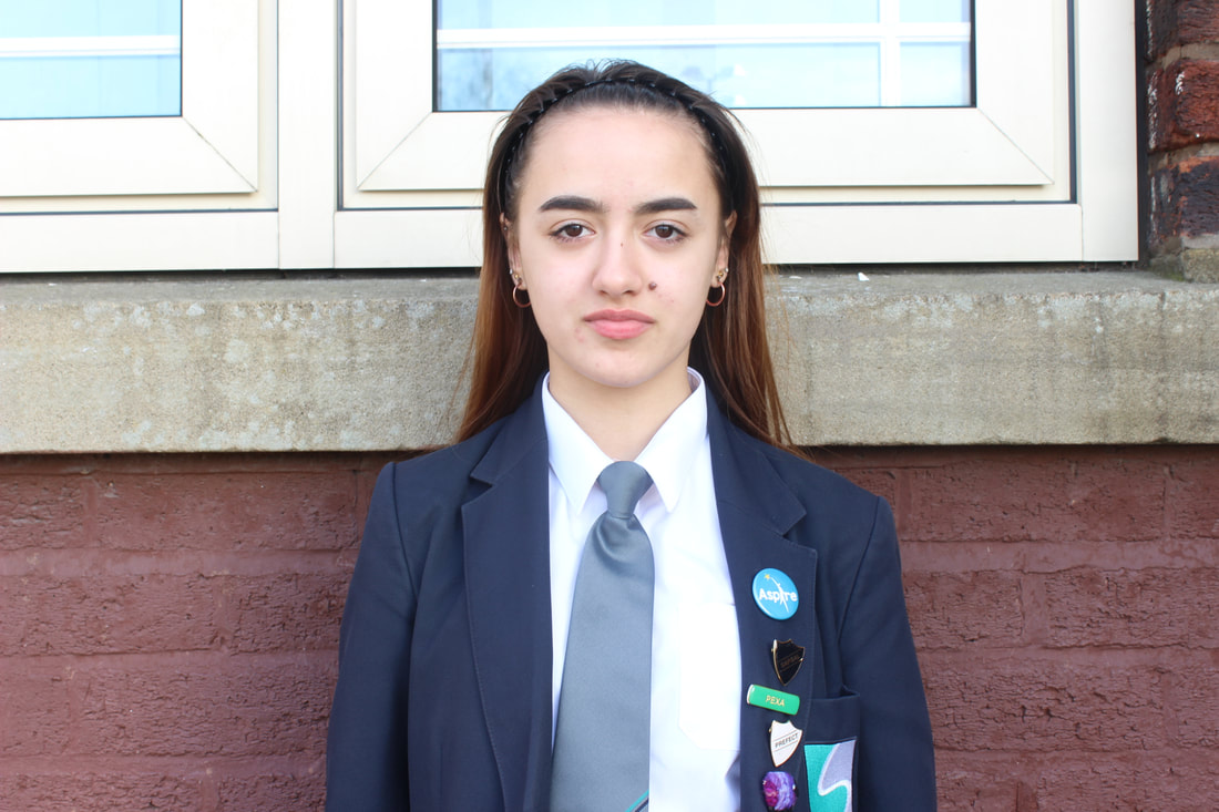
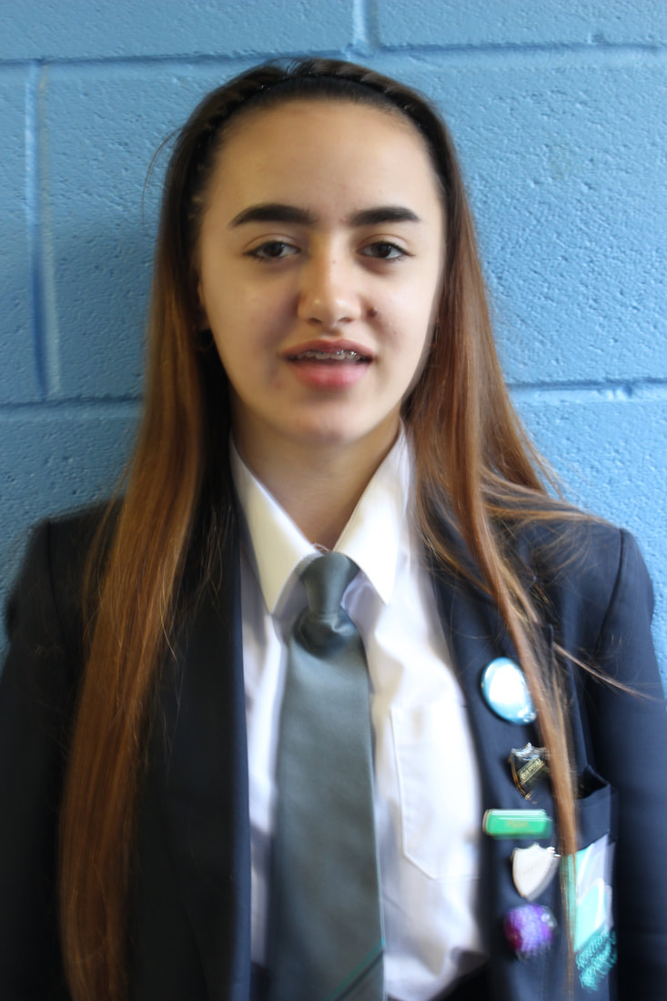
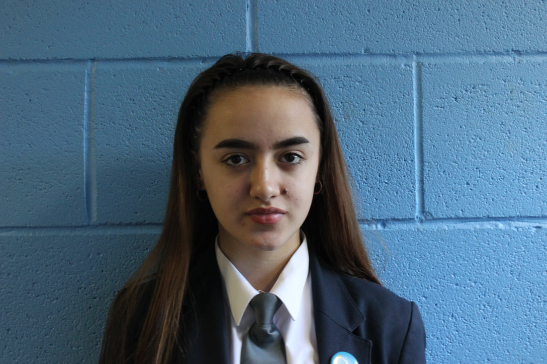
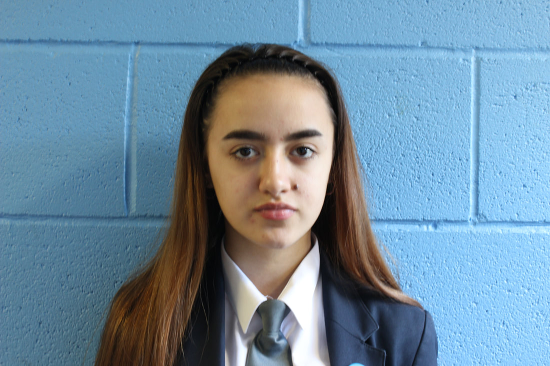
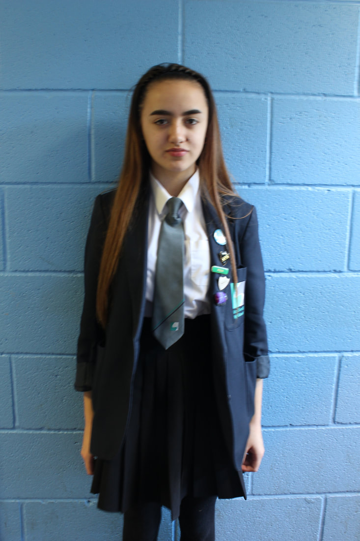
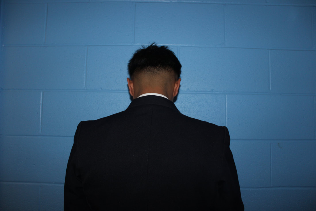
PORTRAIT 1


BEST |
WORST |

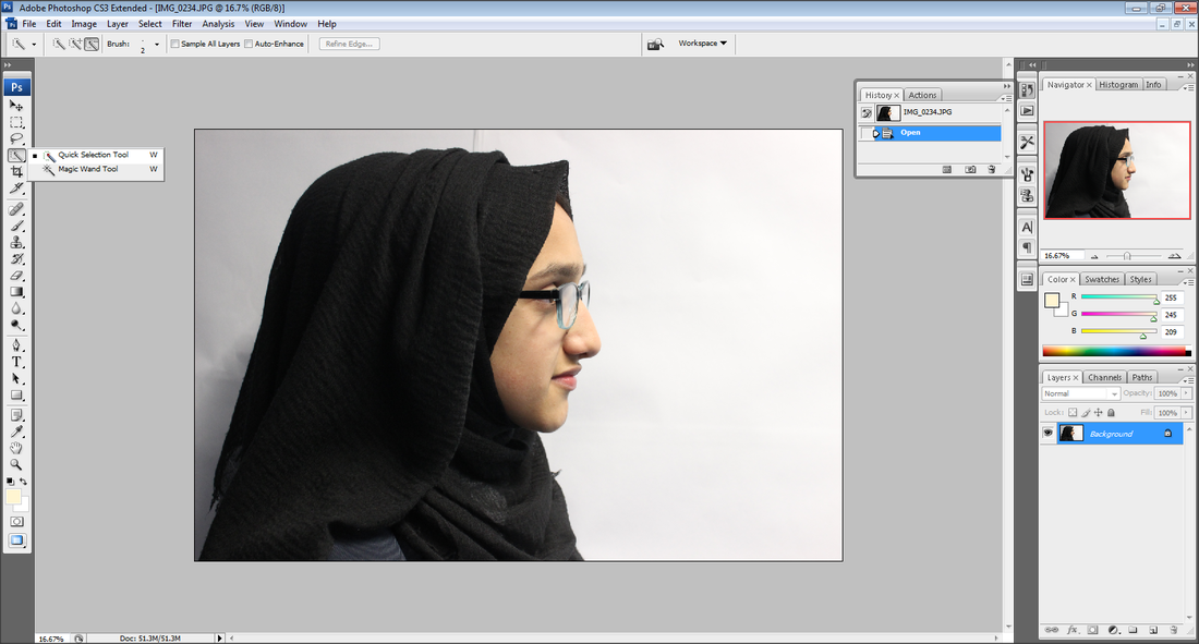
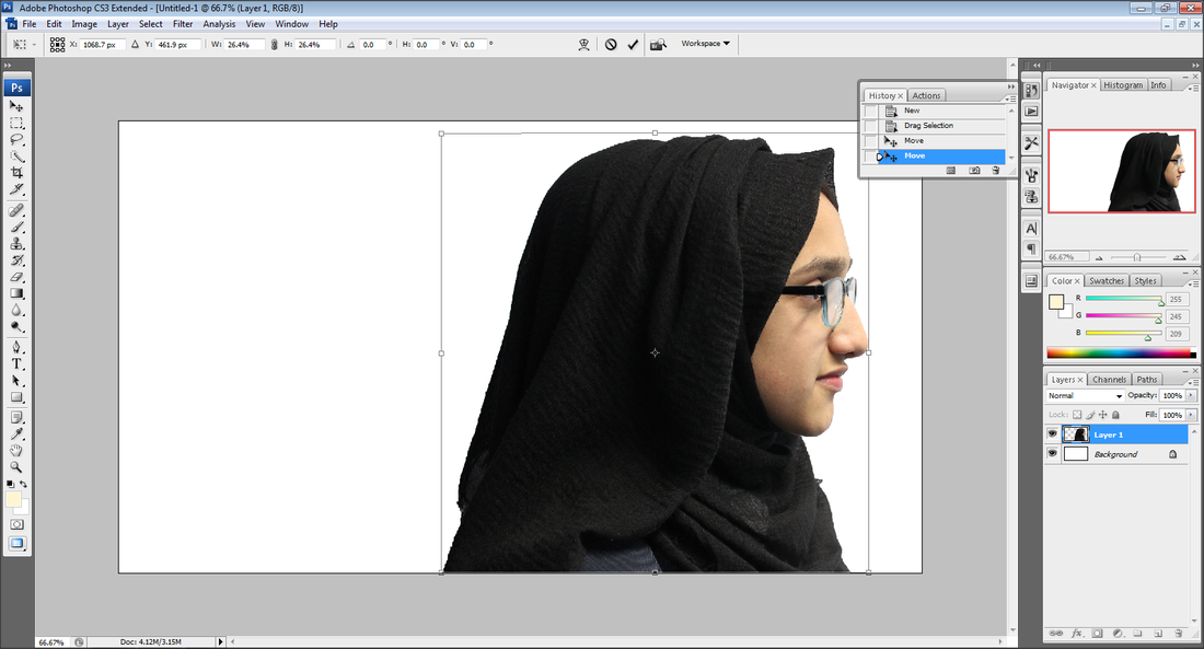
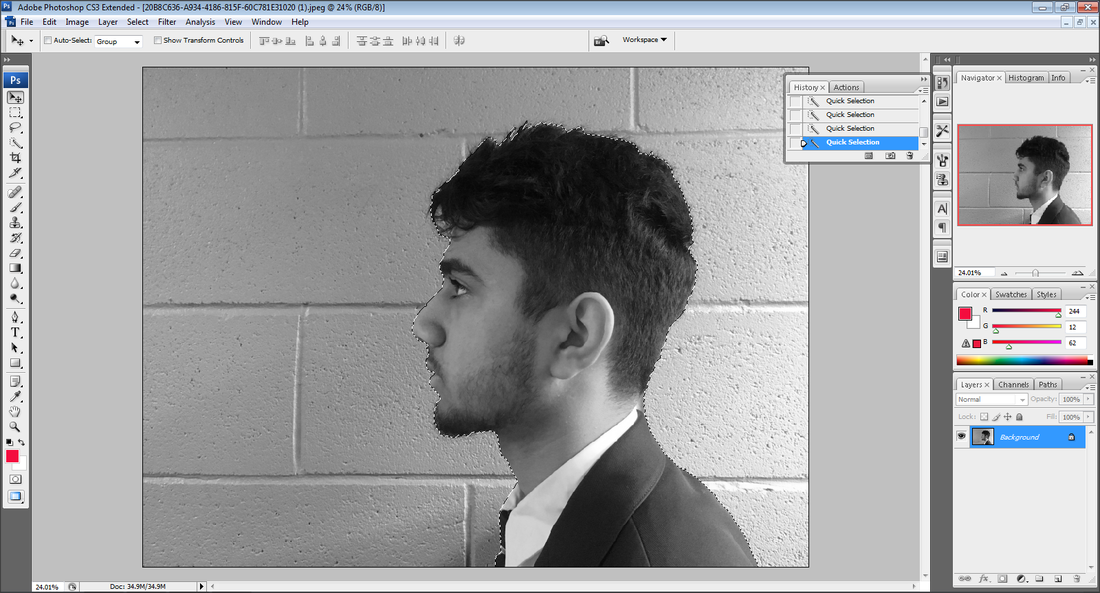
I like this image because of the model facing right. I am happy with the background being white so it contrasts with the model and it is easier to Photoshop. This image was taken at a fast shutter speed so the photograph has sharp edges and lines. I like this photograph because when taking this image the camera had the perfect amount of light being captured. The model was placed on a rule of thirds which I like.
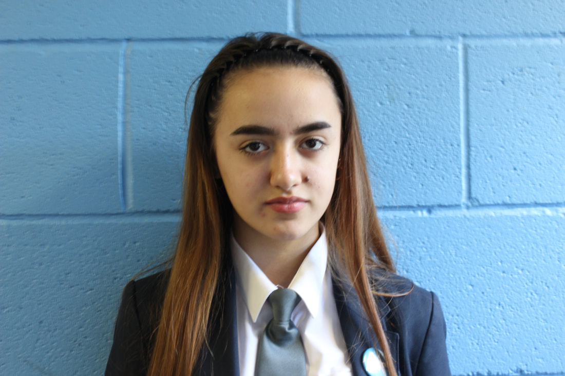
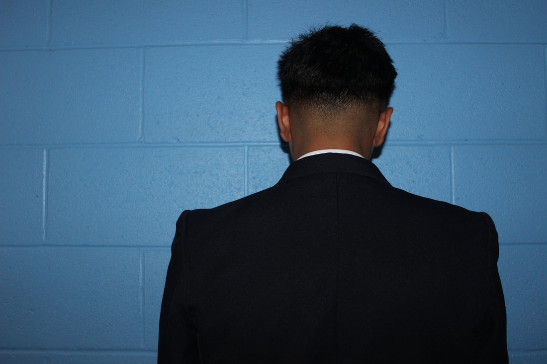
|

I do not like this image because of the very slow shutter speed, which makes the image blurry and fuzzy. I would prefer the model to be facing right so I could Photoshop buildings onto her head. I do not like how half of the image is under exposed because it makes the image look unprofessional. The model seems to have been placed anywhere which also does look messy and untidy. I would have preferred the model to be facing right.
|
DEVELOPING MY WORK

|
|

SECOND ATTEMPT
|
|
FURTHERING MY IDEAS
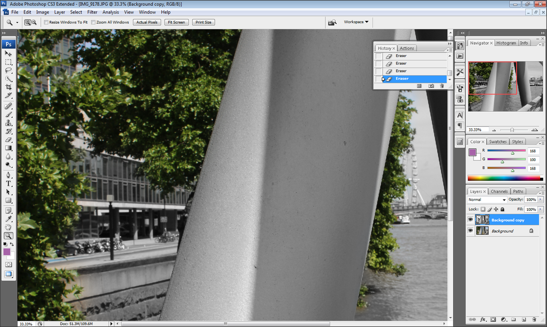
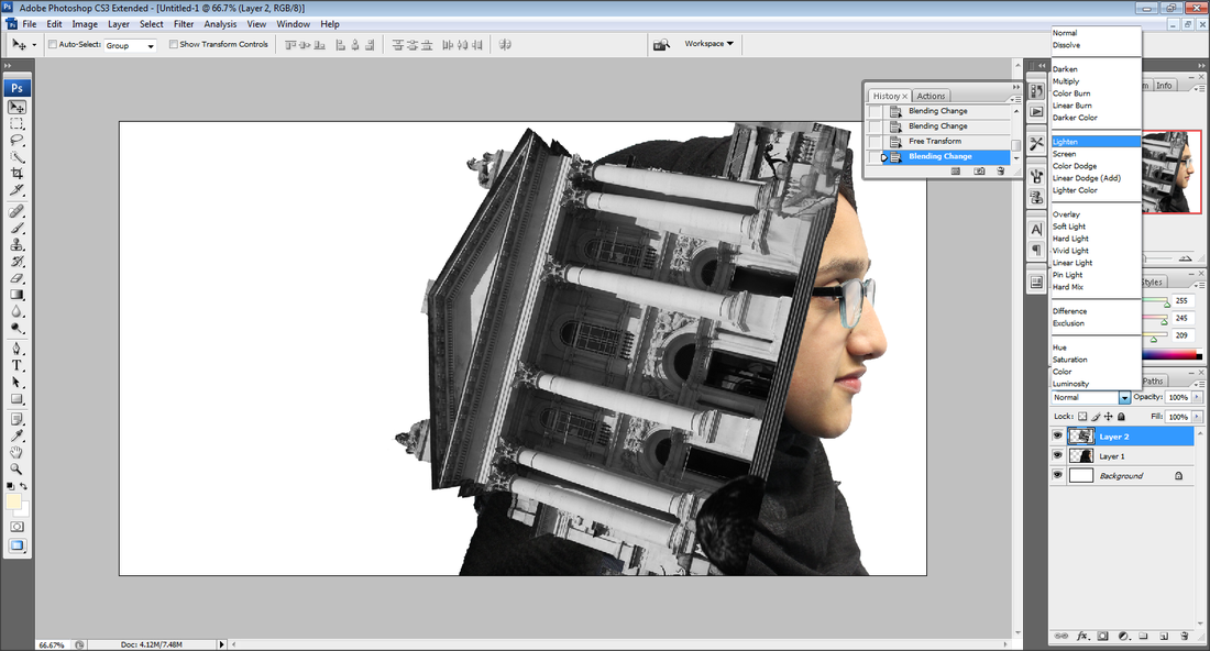
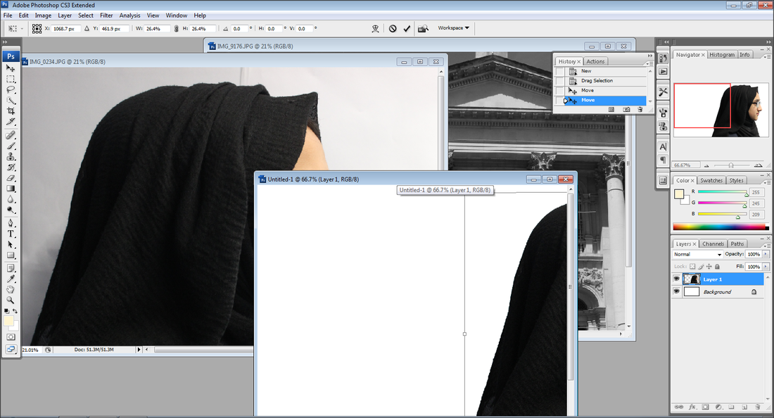
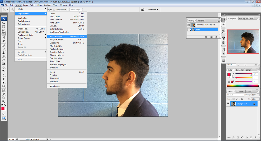
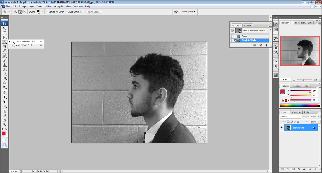
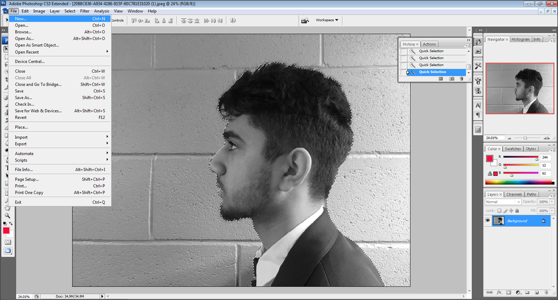
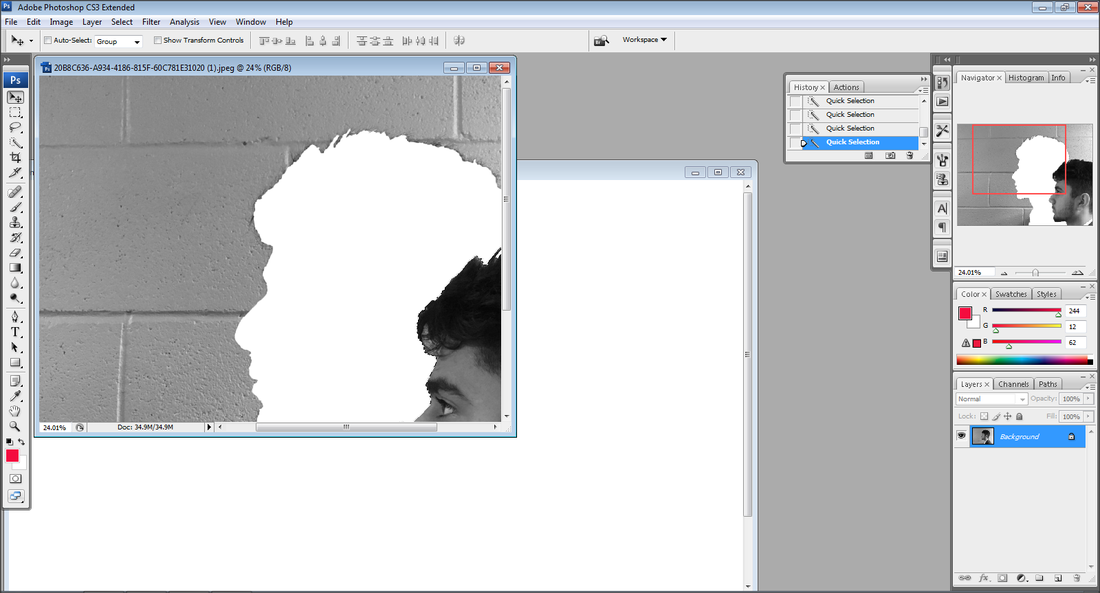
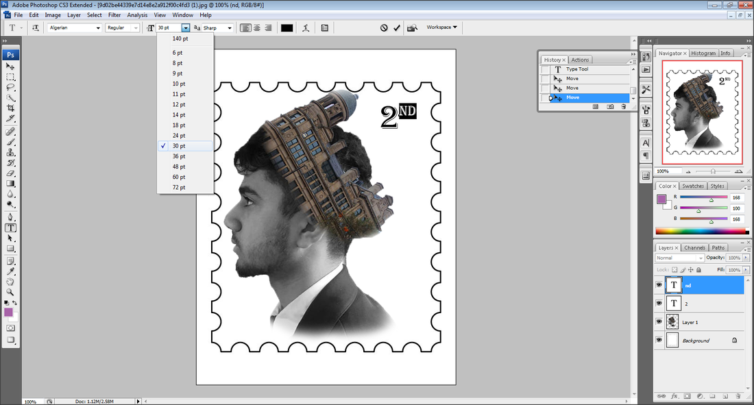
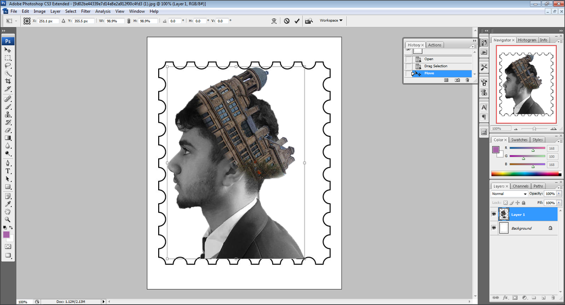
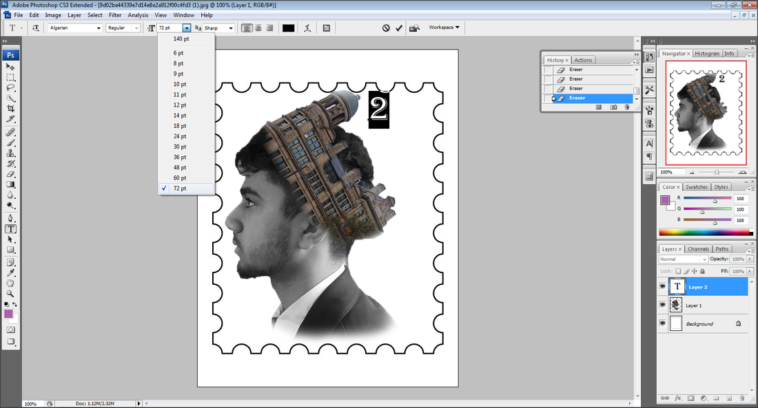
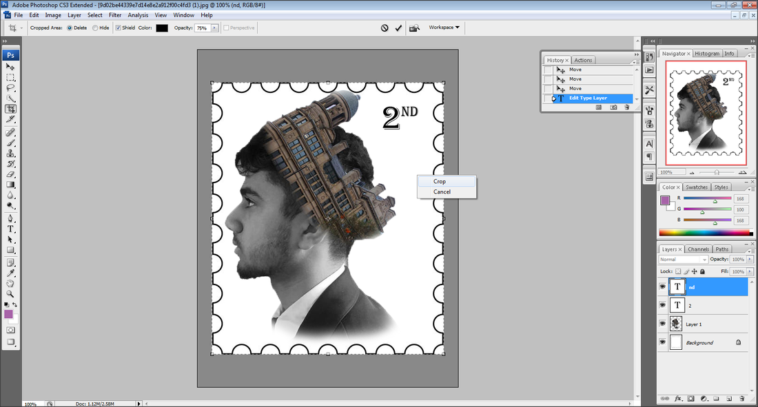
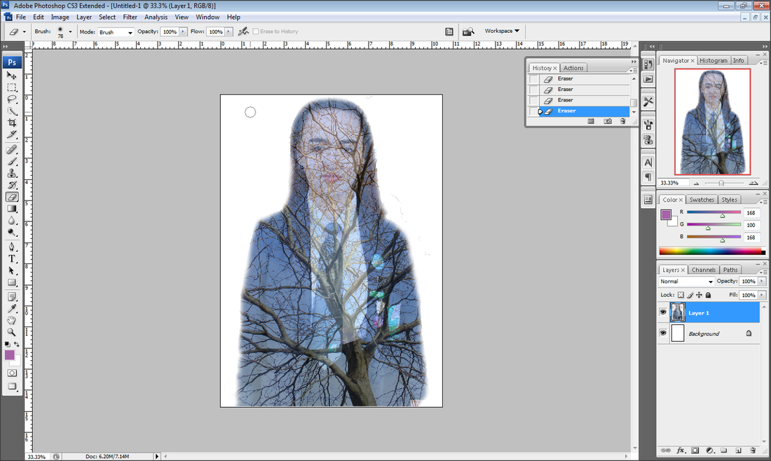
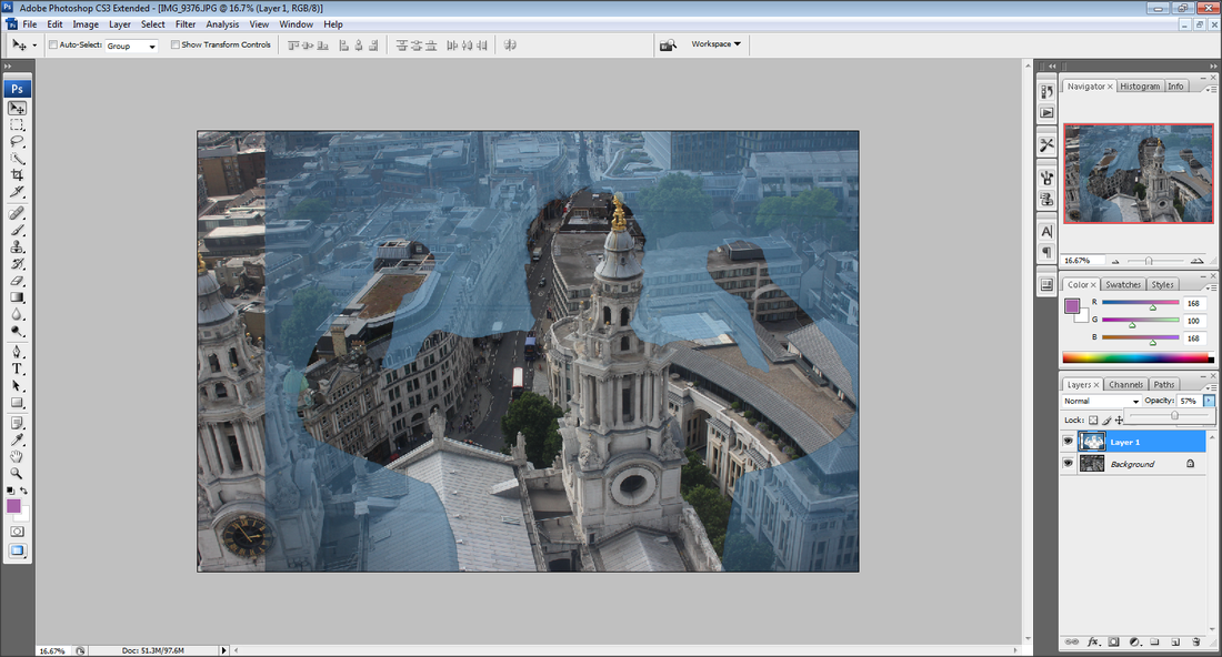
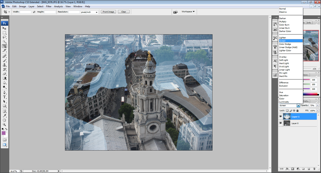
For further outcomes I wish to excel in double exposure and link my work to the work much like Francesco Palaeri however have my own twist with such work from artists as Muhammad Farhead, Luke Gram and Dan Mountford. I wish to add colour to different features of my final outcomes whereas I do like Palaeri's work where his final images were black and white. This unit has been the most meaningful yet mostly because of how I learnt how to do double exposure on photoshop. I feel as if this unit could build me up to become a better photographer since I have learnt so much during it.
Muhammed Faread
|
Dan Mountford
|
Luke Gram
|
Francesco Paleari
|
PORTRAIT 2

|
|
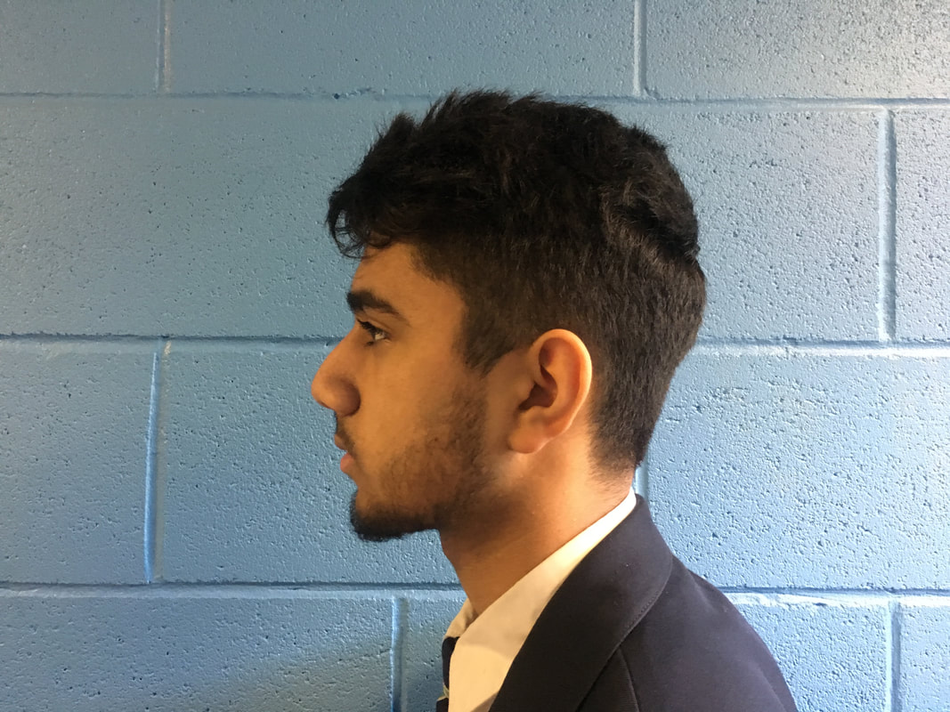
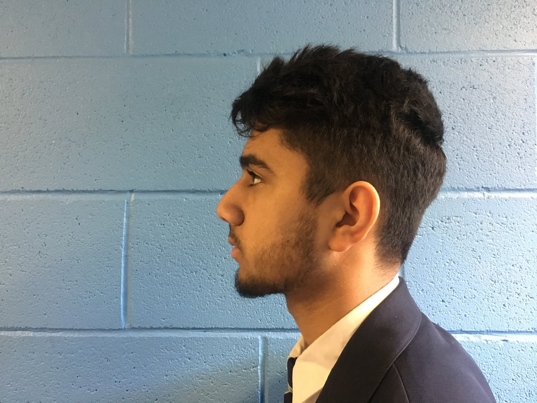
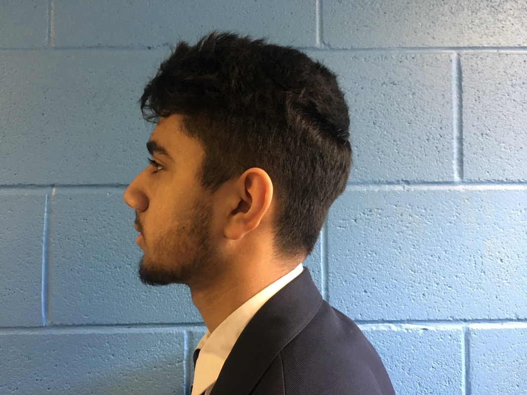
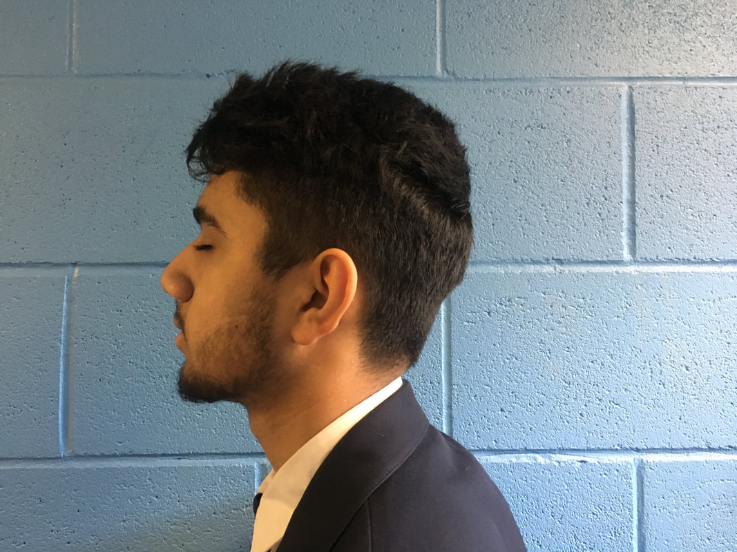
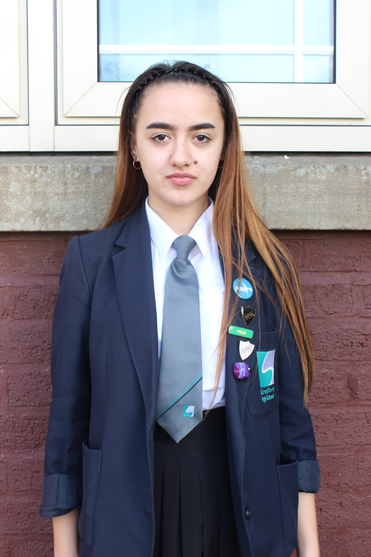
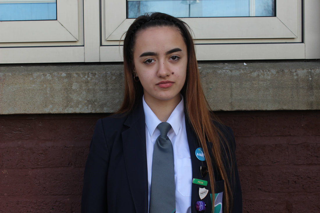
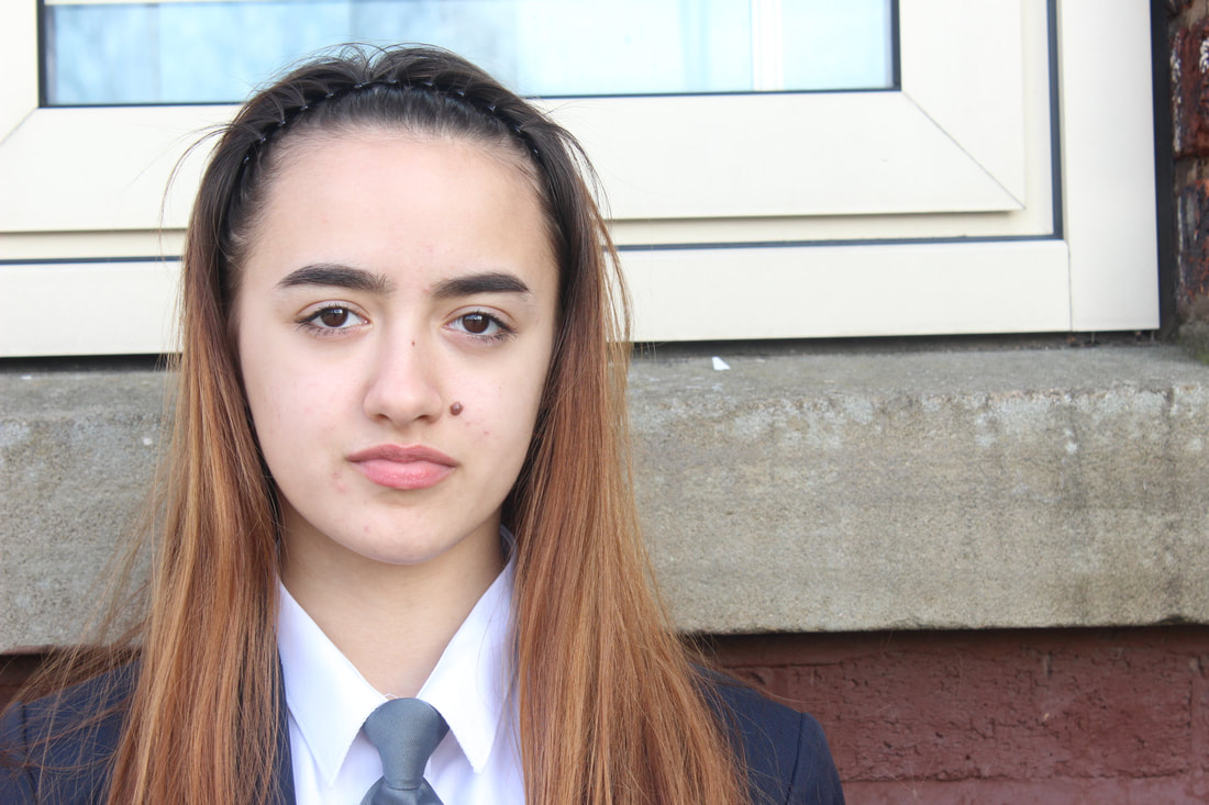
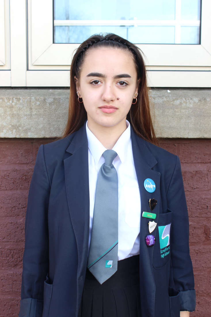
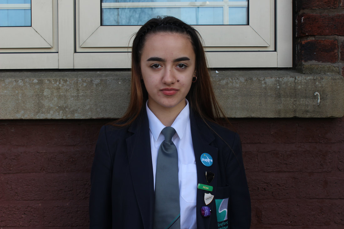
BEST
I like this image because the model is on a rule of thirds. The models eyes are open and the image is perfectly exposed. I believe that the image has a fast shutter speed because the edges are sharp. I like this image because I think that I am able to Photoshop a building perfectly into his head. The background has a contrast between the colours, blue and the models neutral colours.
|
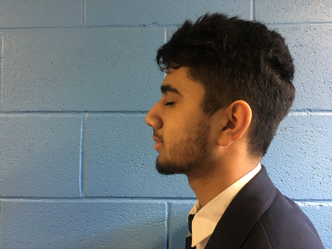
WORST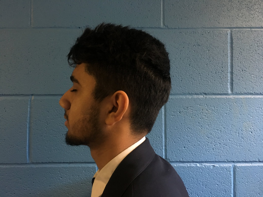
I do not like this image because it is under exposed and the models eyes are closed where I would prefer it to be open. The model is in the middle but I believe that the image would look better if the model was on the rule of thirds. I believe that the image has a slow shutter speed because his hair is blurry and fuzzy.
|
DEVELOPING MY WORK
|
|

SECOND ATTEMPT
|


|
PORTRAIT 3
|
|
|
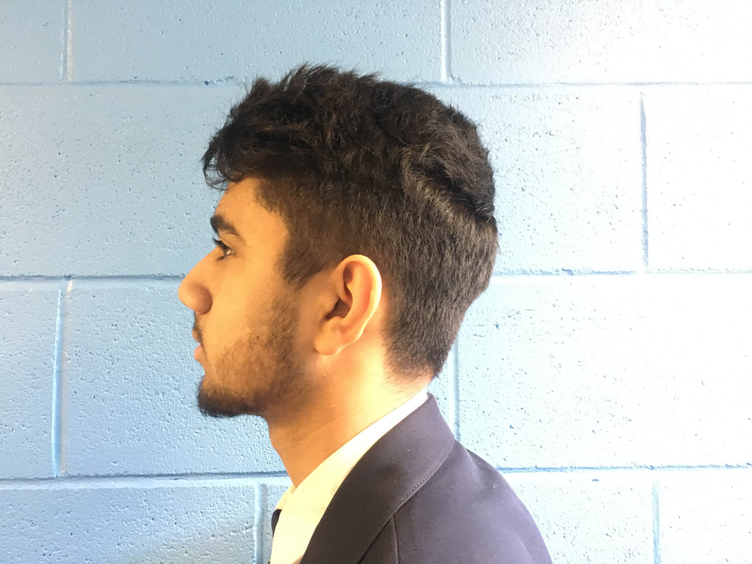
BEST
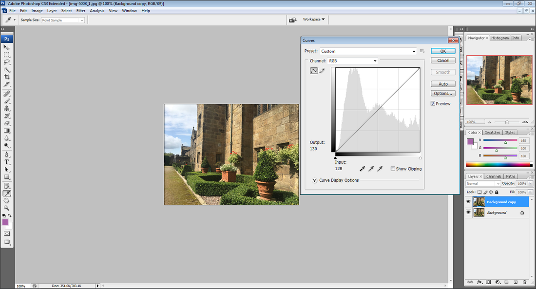
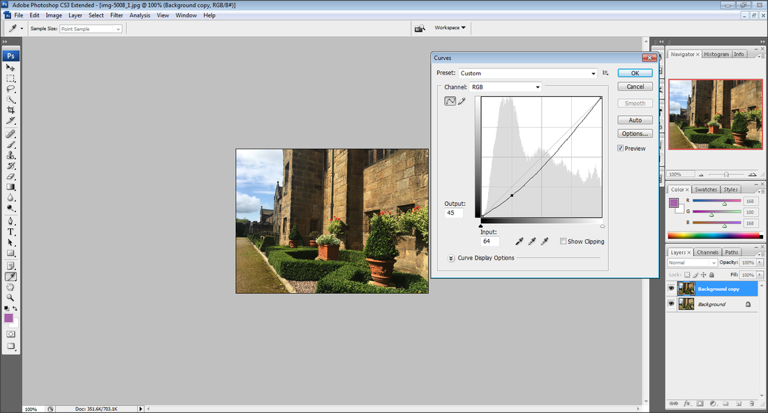
I like this image because the model is in focus and has sharp edges. The model being in the full image creates leading lines from the models arms, leading to her face. I like how I had placed the model in front of a multicoloured wall as the different colours contrast with each other. I believe this image is over exposed however I am able to photo shop this image making it darker by using the tool 'curves'. I like how model has neutral facial expression, as it correlates with the photographers work I have looked at previously.
|
WORST
I do not like this image because it is blurry because I did not use a tripod. The slow shutter speed made the image fuzzy and let too much light in. I do not like how the model is stood in front of a blue wall because the colours do not contrast. I would have preferred the model to have no facial expression but in this image it seems as if the model is speaking which does not look professional. I also do not like how the models body is not in the full image, her arms are slightly cut off from the edges.
|
DEVELOPING MY WORK
|
|
|
|
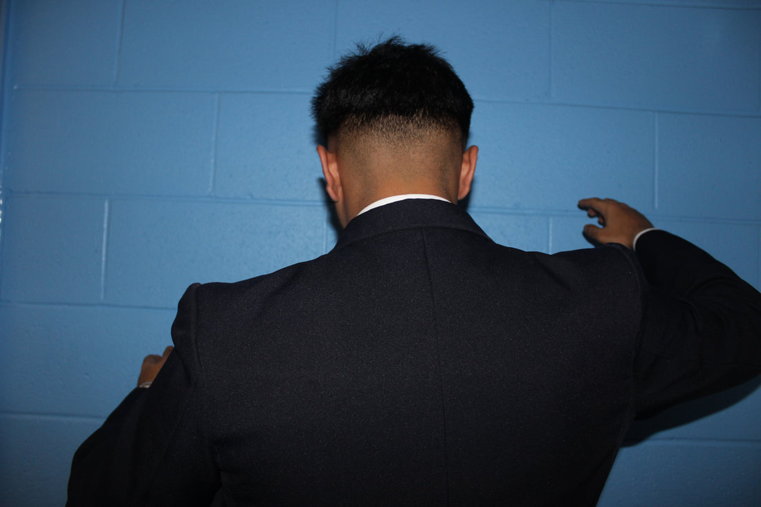
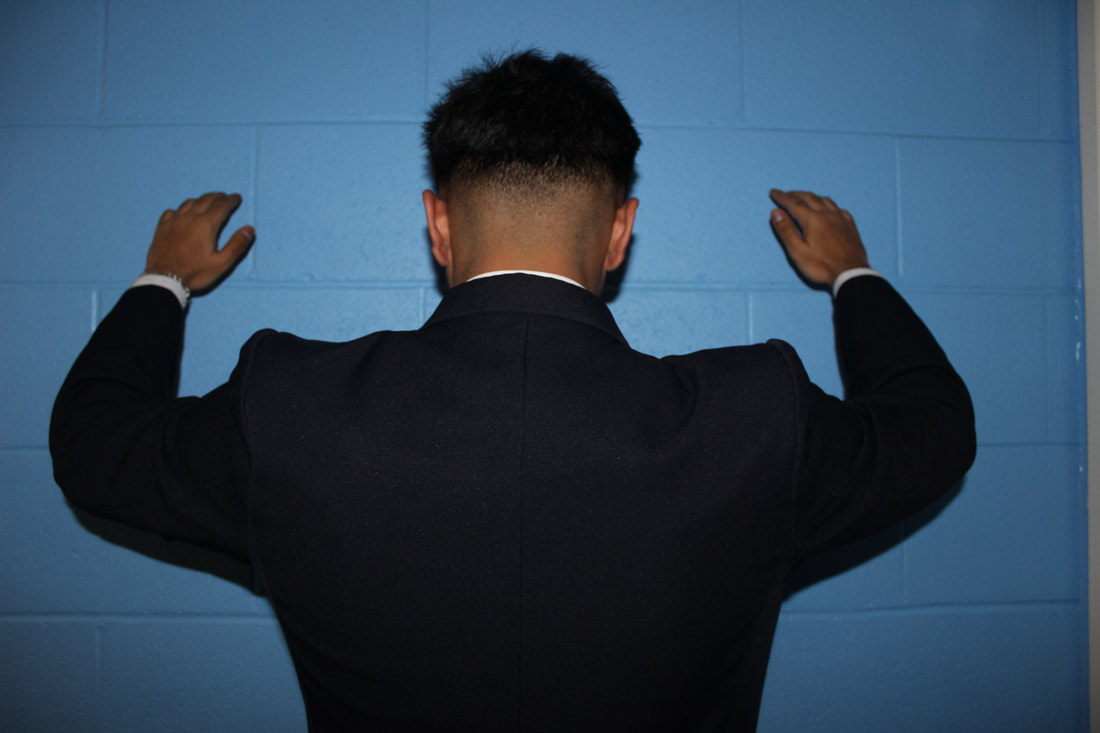
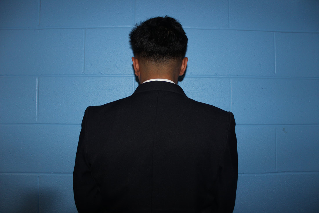
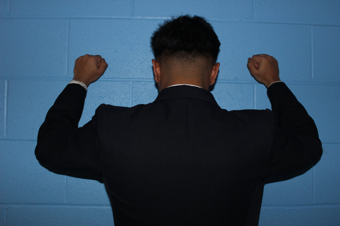
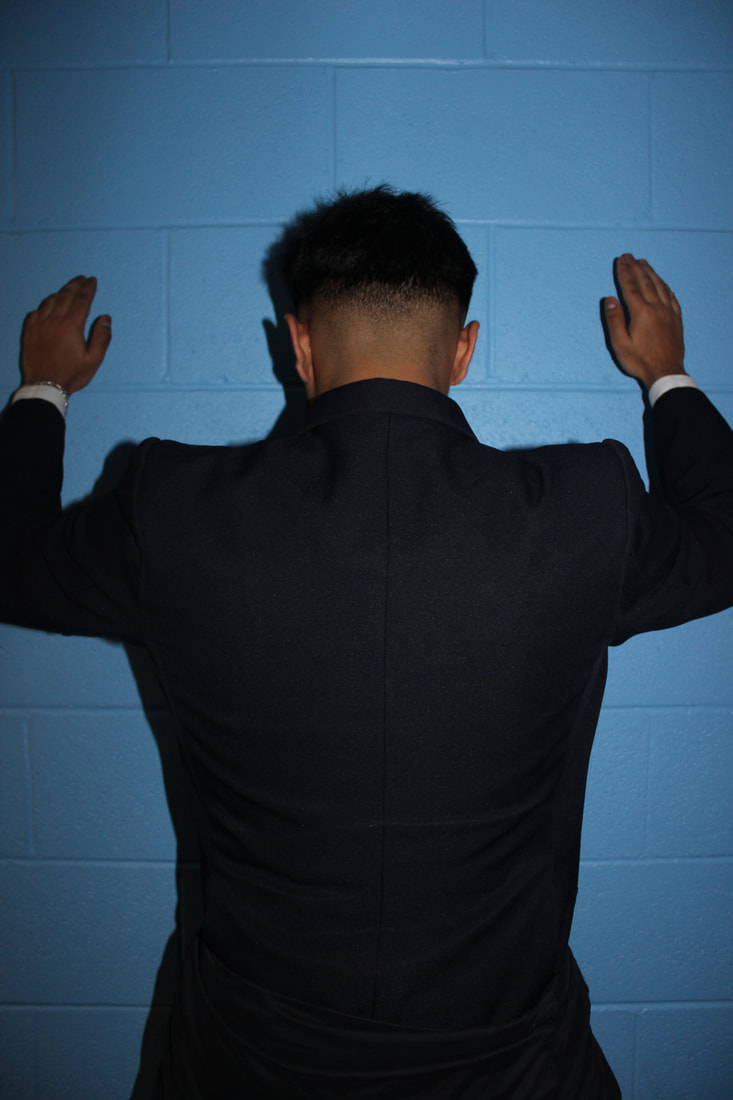
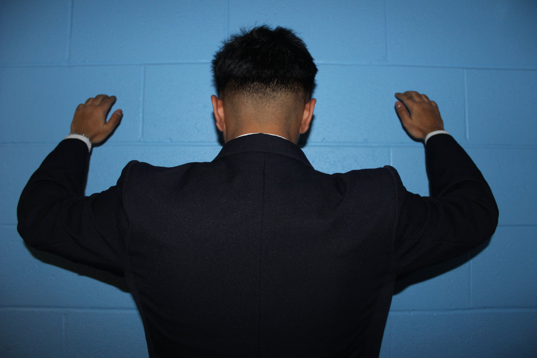
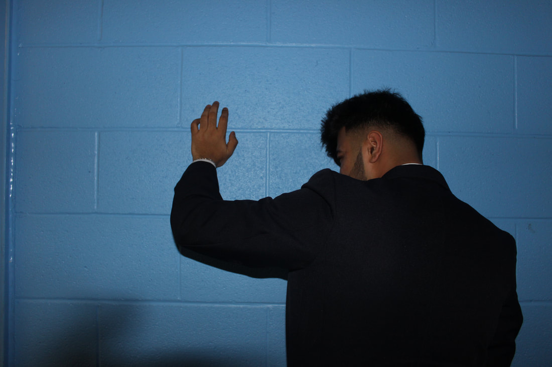
PORTRAIT 4
|
|


|
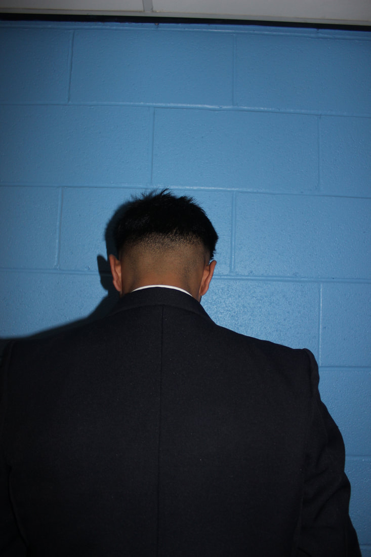
BEST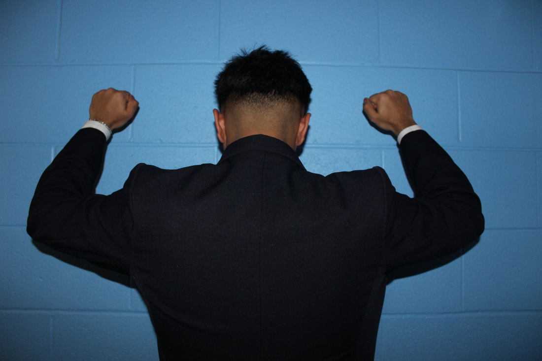
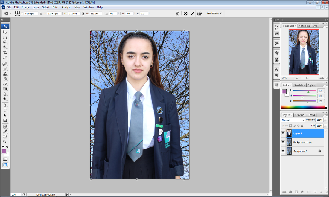
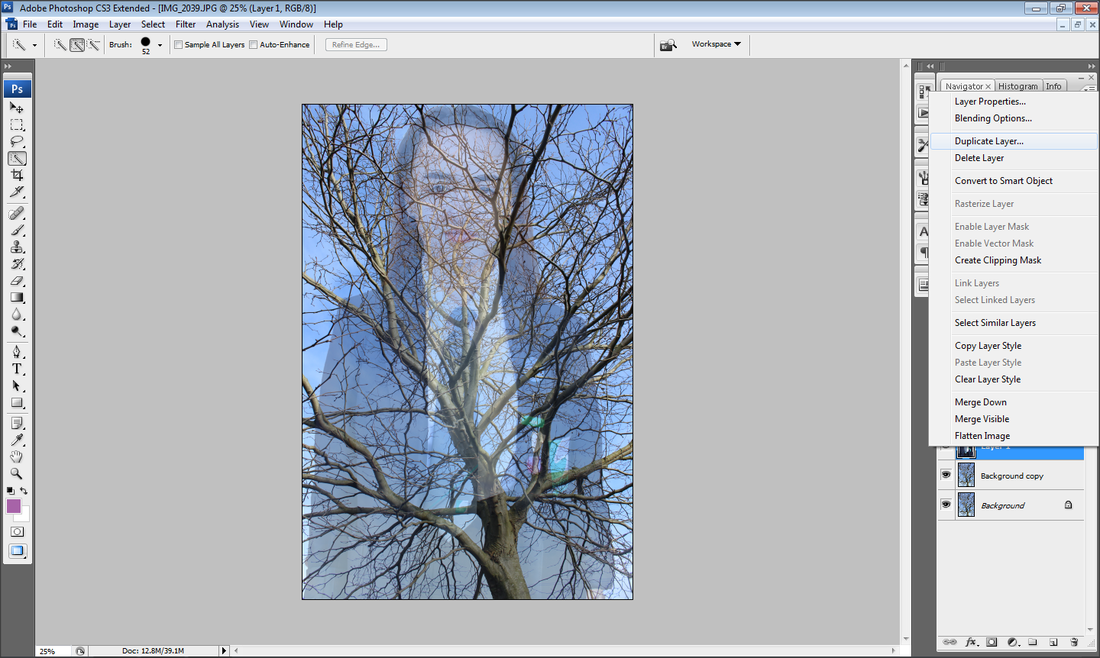
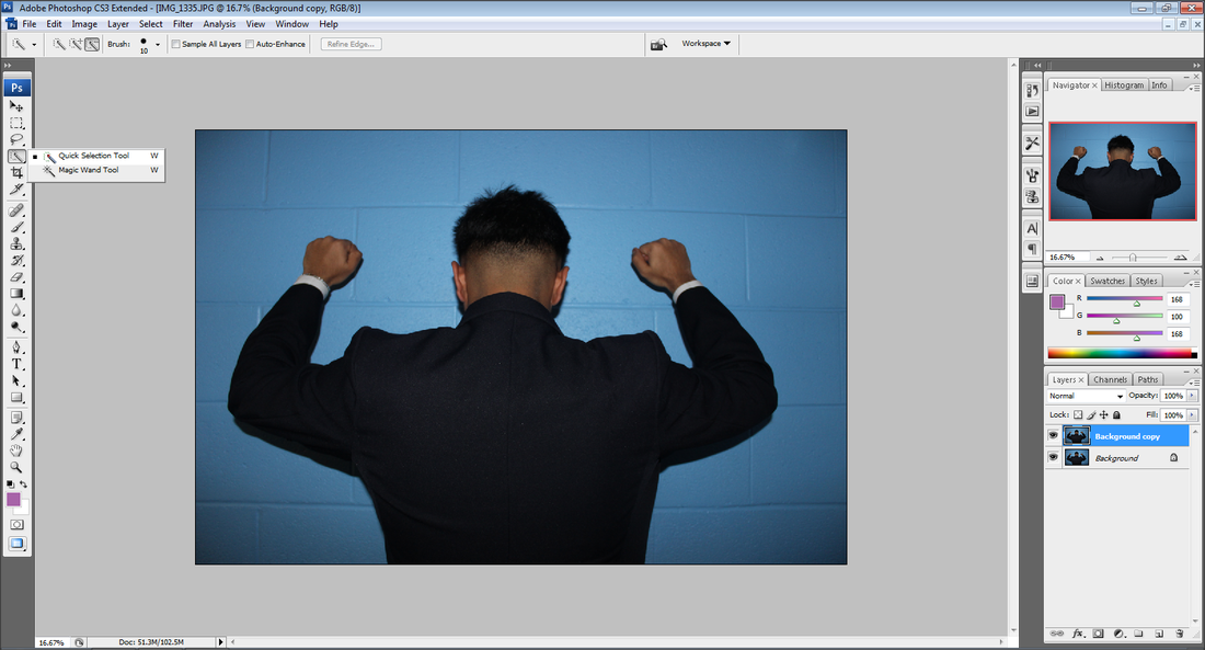
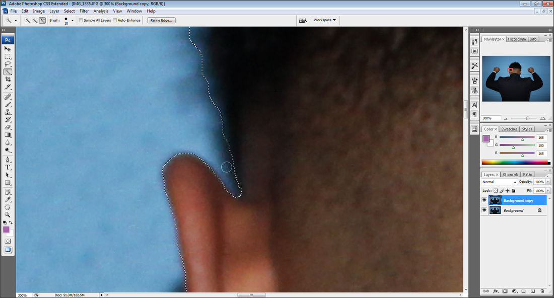
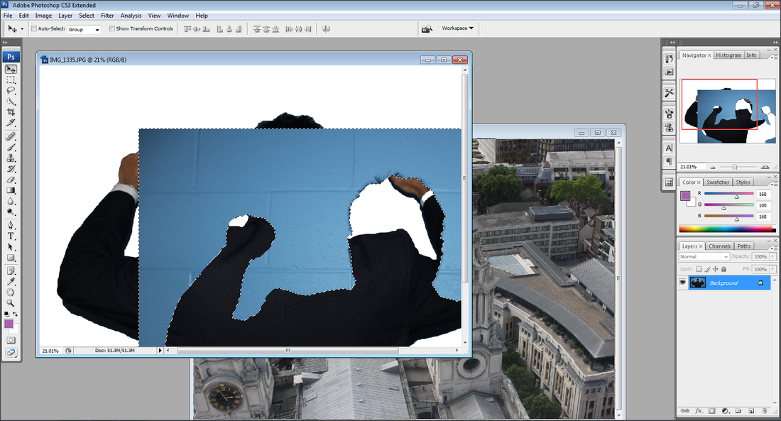
I like this image because of how my model is in focus. With my model being in the middle it defeats the purpose of rule of thirds which I am fond of and I am able to use this image to experiment double exposure on. The lighting has an orange over lay but I will be making the image black and white. I do like how my model is not facing towards the camera because this is related to my artist research.
|
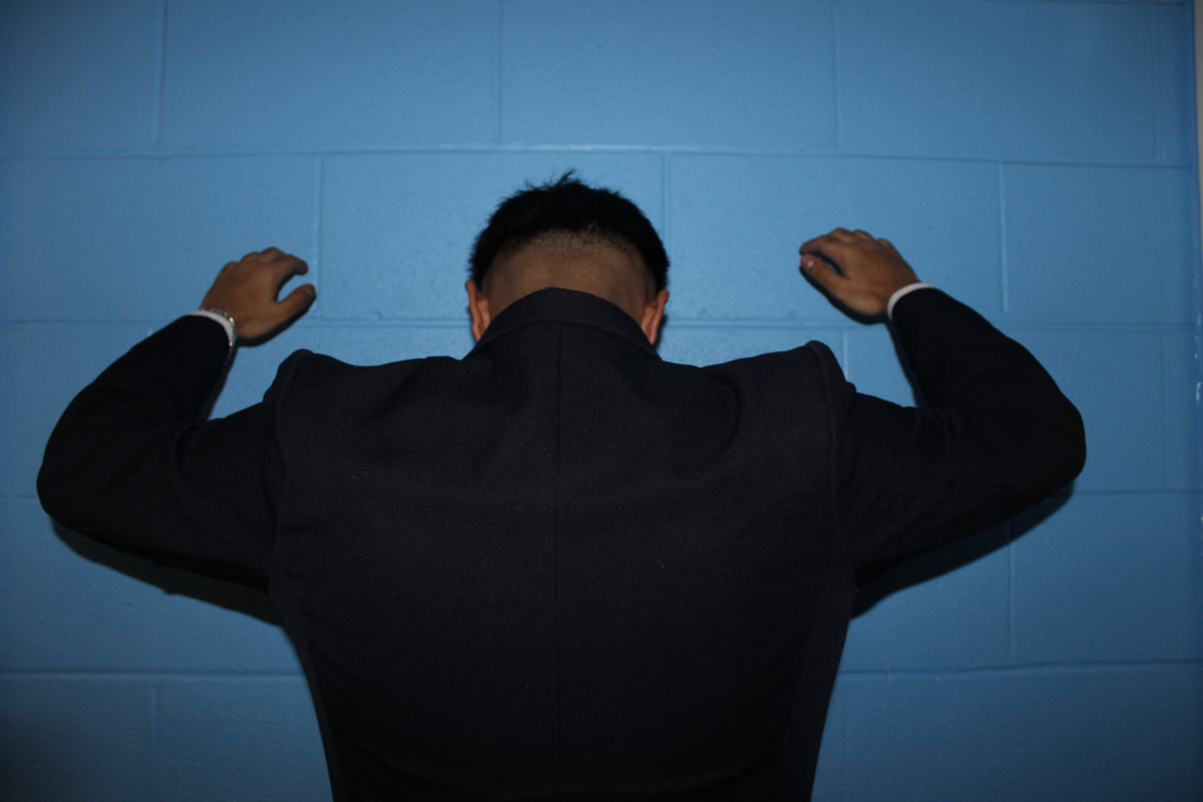
WORST
I do not like this image because my model is over exposed and I feel like with her not being on a hot spot in the rule of thirds I do think it doesn't complement the rest of the image. With the posters being in the shot, it makes the image look unprofessional.
|
DEVELOPING MY WORK

|
|

FINAL OUTCOMES

|

|

|
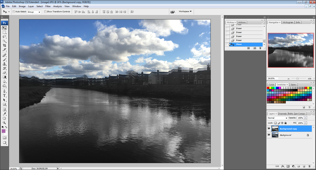
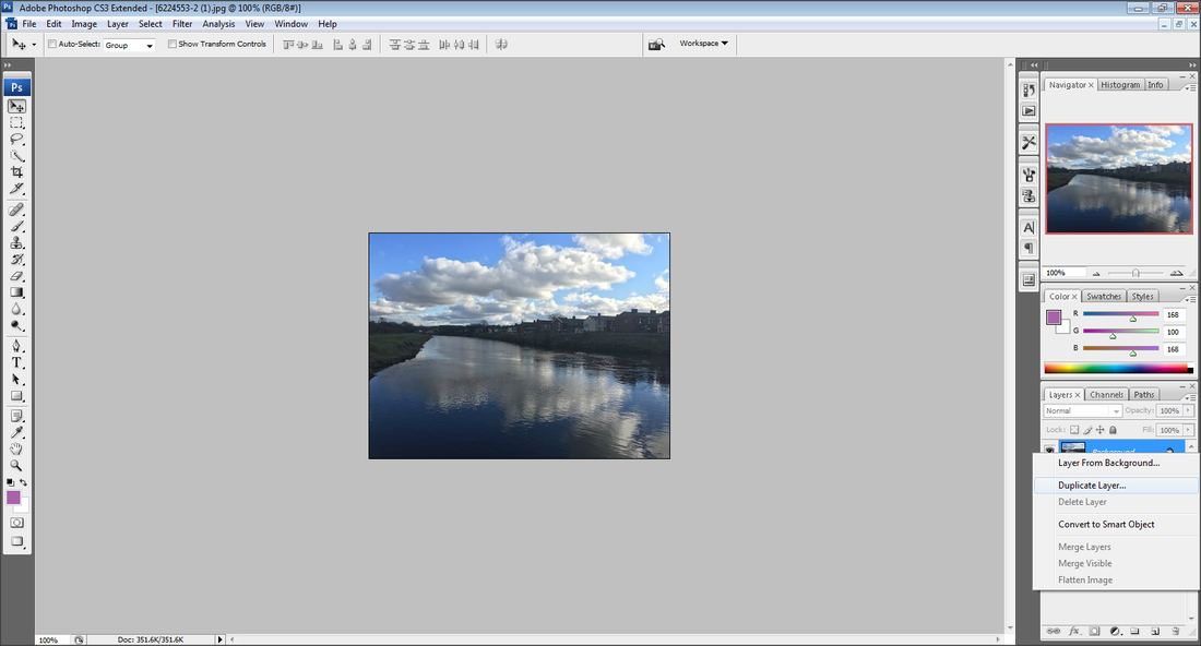
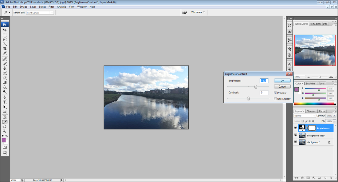
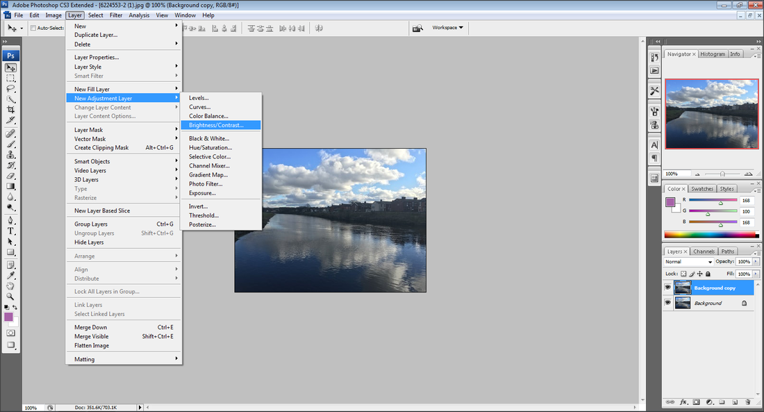
EVALUATION
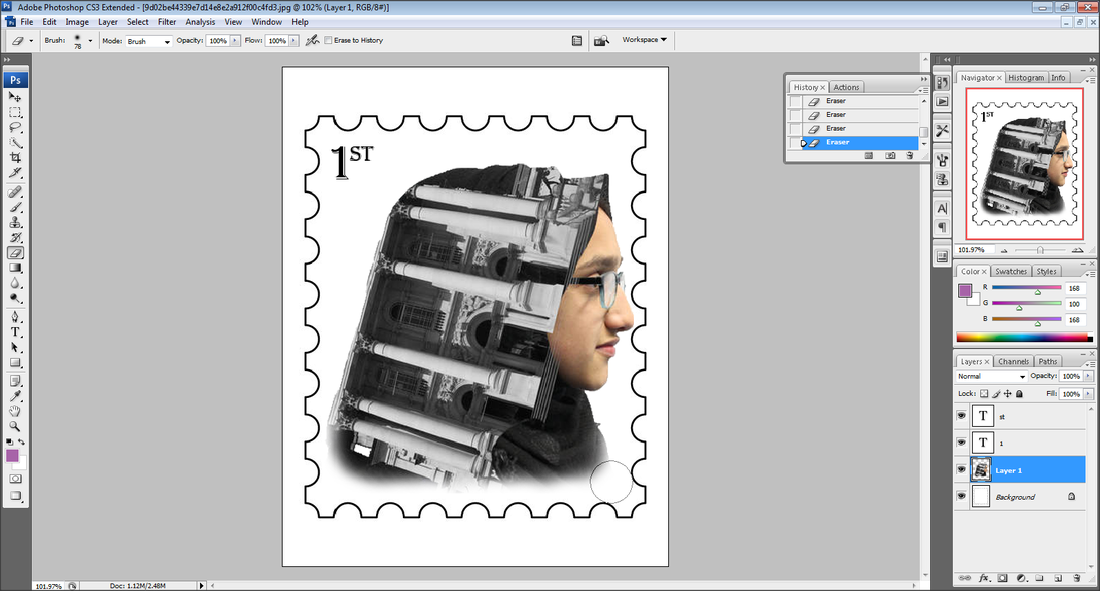
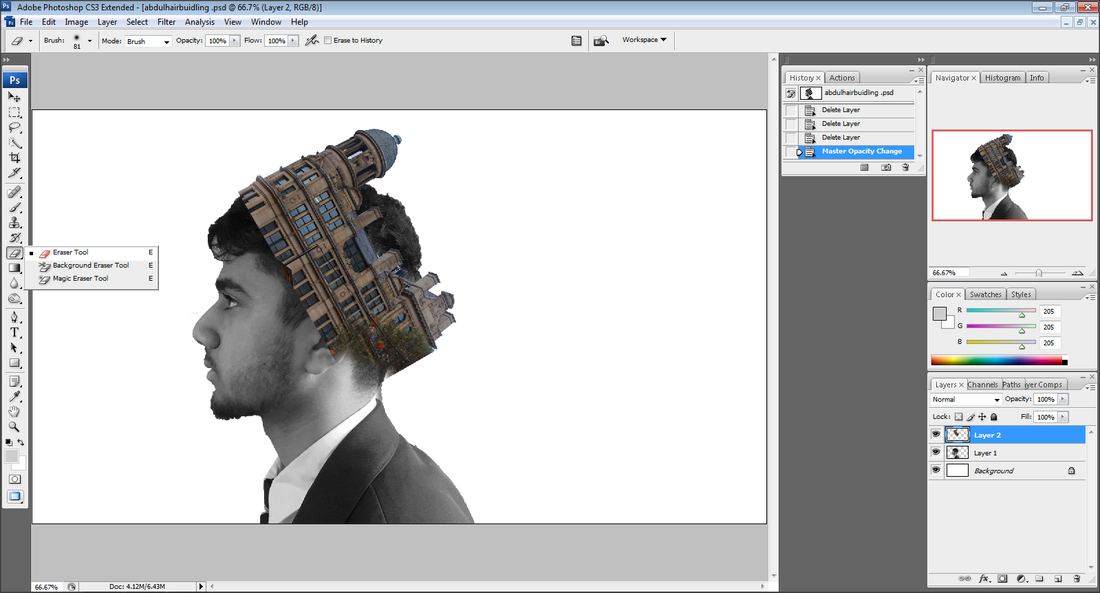
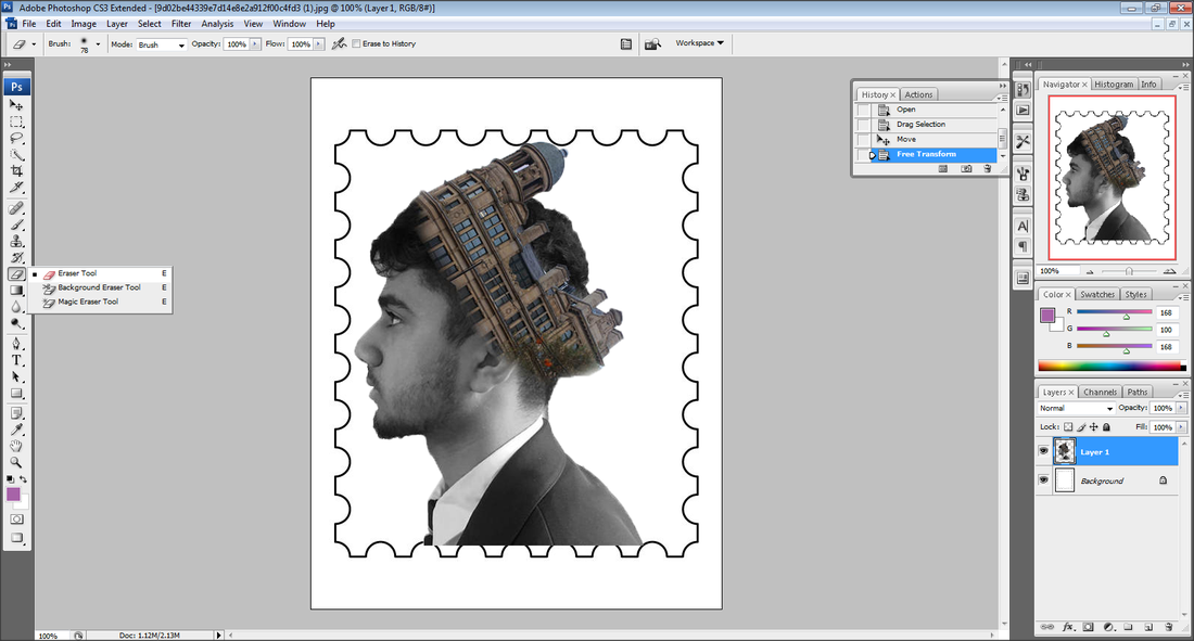
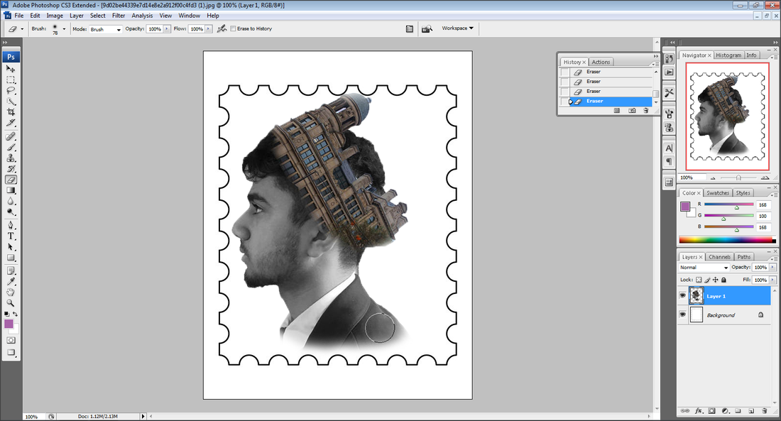
As part of my Architectural Photography I explored a theme of landscape to Photoshop. With the two themes of Landscape and Architecture, it broadened my ideas further. In my Urban and Landscape project I chose to look at different artists to focus on my architectural and landscape photography. At the beginning I researched photographers, such as, Christian Richter, Francesco Paleari and other artists related to architectural photography such as, Reto Fitz and Margaret Yescombe. I believe, referring to my artist research gave me an idea to interpret their work into my own. Once I visited London I believe that I took the best photographs to use for my final outcomes. I took many similar images related to the photographers final outcomes. This project has allowed me to experiment with Photoshop and the different areas of Photoshop which I didn't test in my other projects. I was happy and pleased with my double exposure final outcomes where I experimented with the model being in colour and in black and white with the building being the opposite to relate to my artist research. With this entire shoot I feel most confident with my final outcome, portrait 2, where my model is black and white and the building is in colour and on their head as a crown because it looks realistic because I blended the two images together with the eraser tool on Photoshop. Overall, this project has been the hardest due to needing to visit different places but because I took the time to go I came out with wonderful results. This shows a huge improvement from a sub-unit like Slinkachu where half of my images where unreliable.
